Textile Museum of Canada
Information Architecture Course Project

2023, Toronto, 4 weeks

Team

Beibei Hu, Elize Khan,

Xiaohan Hou, Shumira Ranjith

ELIZE KHAN

XIAOHAN HOU

SHUMIRA RANJITH


Improve textile museum visitors' digital experience

The Textile Museum of Canada is a museum in Toronto, Canada that is dedicated to the collection, exhibition, and documentation of textiles.


How might we use our knowledge to redesign the information architecture and navigation of the museum's website, and provide online visitors an intuitive and joyful navigation experience?


My Role

Card sorting, Content Audit, IA diagram

Skills Developed

Information Architecture, Prototyping

Tool

Figma, Miro, Excel, DynoMapper

Intended Users

EMERGING YOUNG POPULATIONS
UNDERREPRESENTED GROUPS
HISTORY ENTHUSIASTS
DONORS
VIRTUAL MEMBERS
TEXTILE EDUCATORS
"Great consideration of our concerns and brought up issues we hadn't thought of before that we'll now have to think about!"

Caitlin, CEO of Textile Museum

Content Audit

& Analysis

Card Sorting

Identify Gap

Prototype

IA rebuild

Design Process

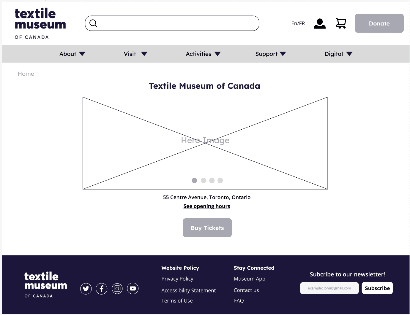
Desktop

Recommendations

  • Information Access

  • Newsletter Subscription

  • Essential Information Accessibility

  • Newsletter Sign-Up Link

  • ESL Explanation of Words

  • Admission Fee Clarity

Card Sorting

Identify Gap

Prototype

Design Process

Content Audit

& Analysis

IA rebuild

Tool

Figma, Miro

Skills Developed

Information Architecture, Prototyping

My Role

Card sorting, Content Audit, IA diagram

Team

Beibei Hu, Elize Khan,

Xiaohan Hou, Shumira Ranjith

Textile Museum of Canada
Website Redesign (Information Architecture)

2023, Toronto, 4 weeks


Improve textile museum visitors' digital experience

The Textile Museum of Canada is a museum in Toronto, Canada that is dedicated to the collection, exhibition, and documentation of textiles.


How might we use our information architecture knowledge to provide online visitors an intuitive and joyful navigation experience?

HISTORY ENTHUSIASTS

Intended Users

EMERGING YOUNG POPULATIONS
UNDERREPRESENTED GROUPS
DONORS
VIRTUAL MEMBERS
TEXTILE EDUCATORS

Content Audit

Criteria

C

Business focused criteria
Connection to strategy and key message
User-focused criteria

How actionable/relevant the page

is related to the business related items

Attracting a larger crowd, particularly

marginalized individuals

How functional the website is

to support the tasks of the users

How actionable/relevant the page

is related to the business related items

Attracting a larger crowd, particularly

marginalized individuals

How functional the website is

to support the tasks of the users

Analysis

Dividing up the Exhibits and Events into

‘current’, ‘upcoming’ and ‘previous’

  • help the user with easily navigating

    which exhibits or events they’re interested in

Review the pages ‘Contact us’,

and ‘Visit us’

  • The information might be redundant

Remove the ‘Cloth and Clay’ page

  • The layout of this page does not seem to be very

    consistent with the museum’s branding style

Adding a dedicated Newsletter page

  • help individuals stay up to

    date with the museum’s latest updates

56

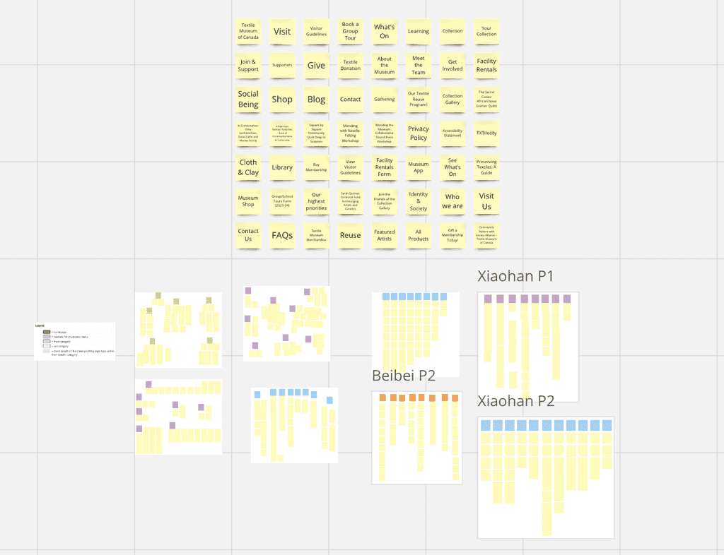
Cards

Key Insights

8

Participants


Open Card Sorting

Current Website
Gap

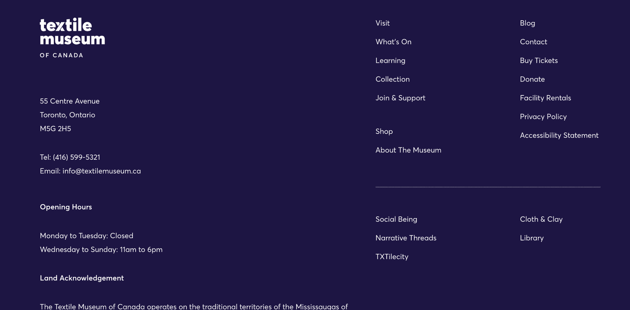
  1. Current footer contains a lot of

information which is overwhelming

to the user

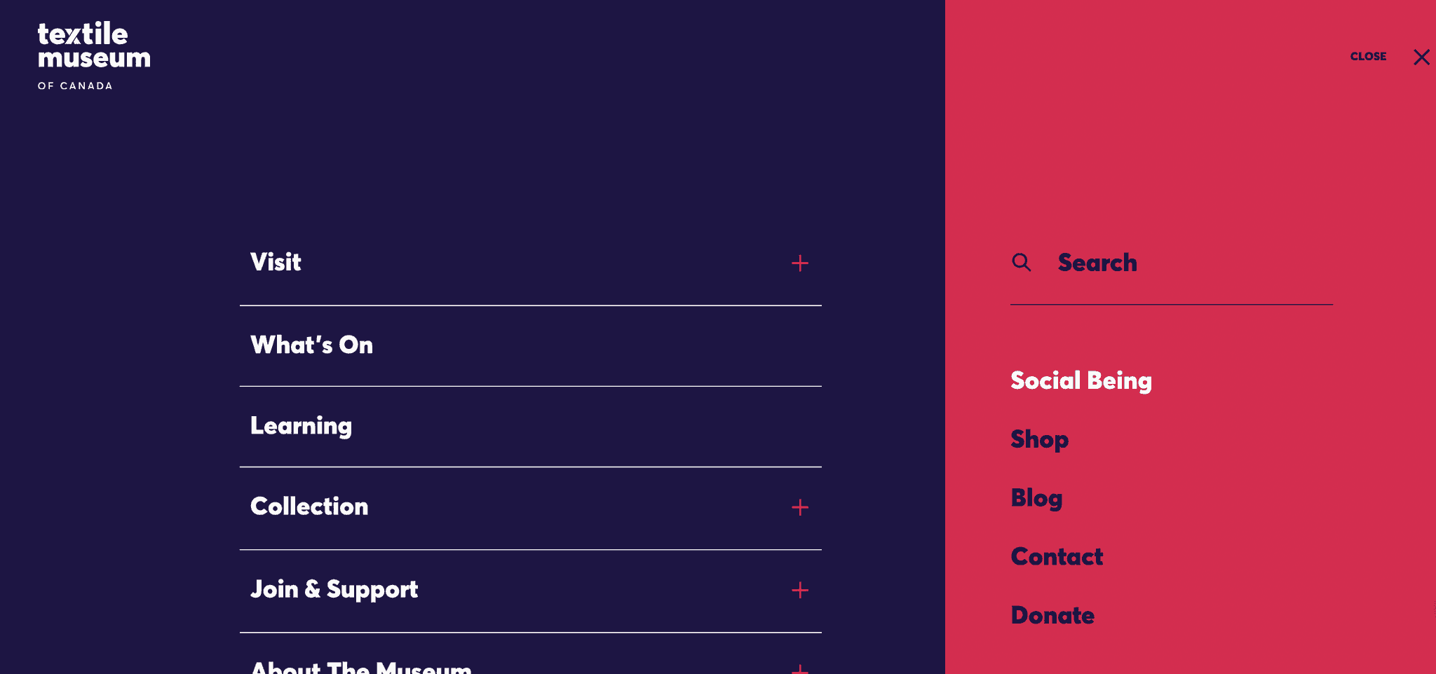
  1. Hamburger menu hides

important information from the user

Streamlined Navigation System

Using Simplier Language

&

  1. Language used for the

current pages is too vague

Solution

  1. Remove the hamburger menu

for the desktop and condense

the numerous categories.

  1. Simplify footer and move ‘Visit’

to primary navigation only

  1. Use clear and straightforward

language

Information Architecture

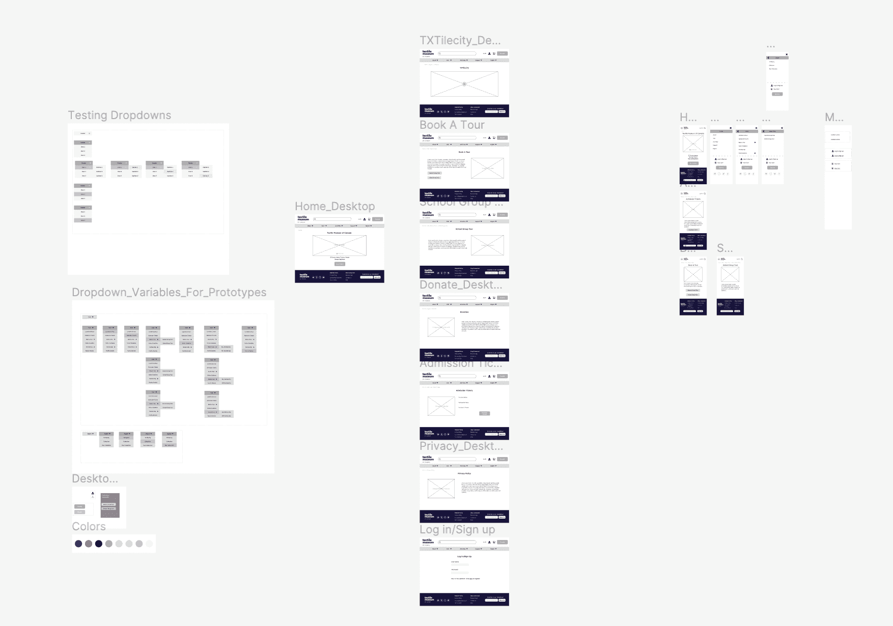
Mid-fi Prototype

"Great consideration of our concerns and brought up issues we hadn't thought of before that we'll now have to think about!"

Caitlin, CEO of Textile Museum

  • Narrow Target Audience Awareness

  • Simplify Navigation Language

  • Prefer Content Over Commercialization

  • Address Overwhelming Site Design

Information Architecture

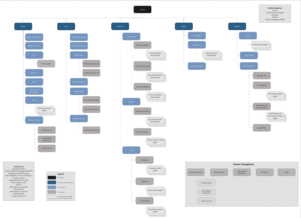
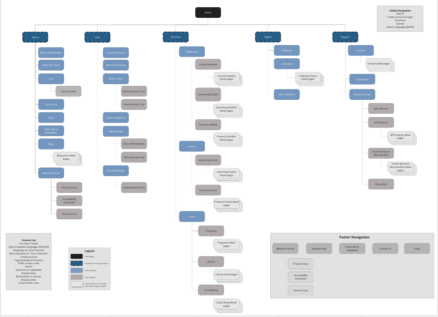
  • Main Diagram: The level 0 category is Home, followed by Level 1 categories in dark blue, Level 2 categories in light blue and Level 3 categories in grey, followed by the content stack pages.

  • Utility navigation (Top-Right): Provide users with quick access to essential functions on a website to improve overall efficiency, such as login, donate, checkout and search.

  • Feature list (Bottom-Left): Highlight the key attributes of the site in a concise list to help the user with further exploring the site.

  • Footer Navigation (Bottom-Right): Serves as a space for essential information that we aim to present to users without requiring them to navigate through a menu or actively search for specific details.

What does our customer want?

Easy to Use
Support Business Growth
Scalable and editable
Promote community programs

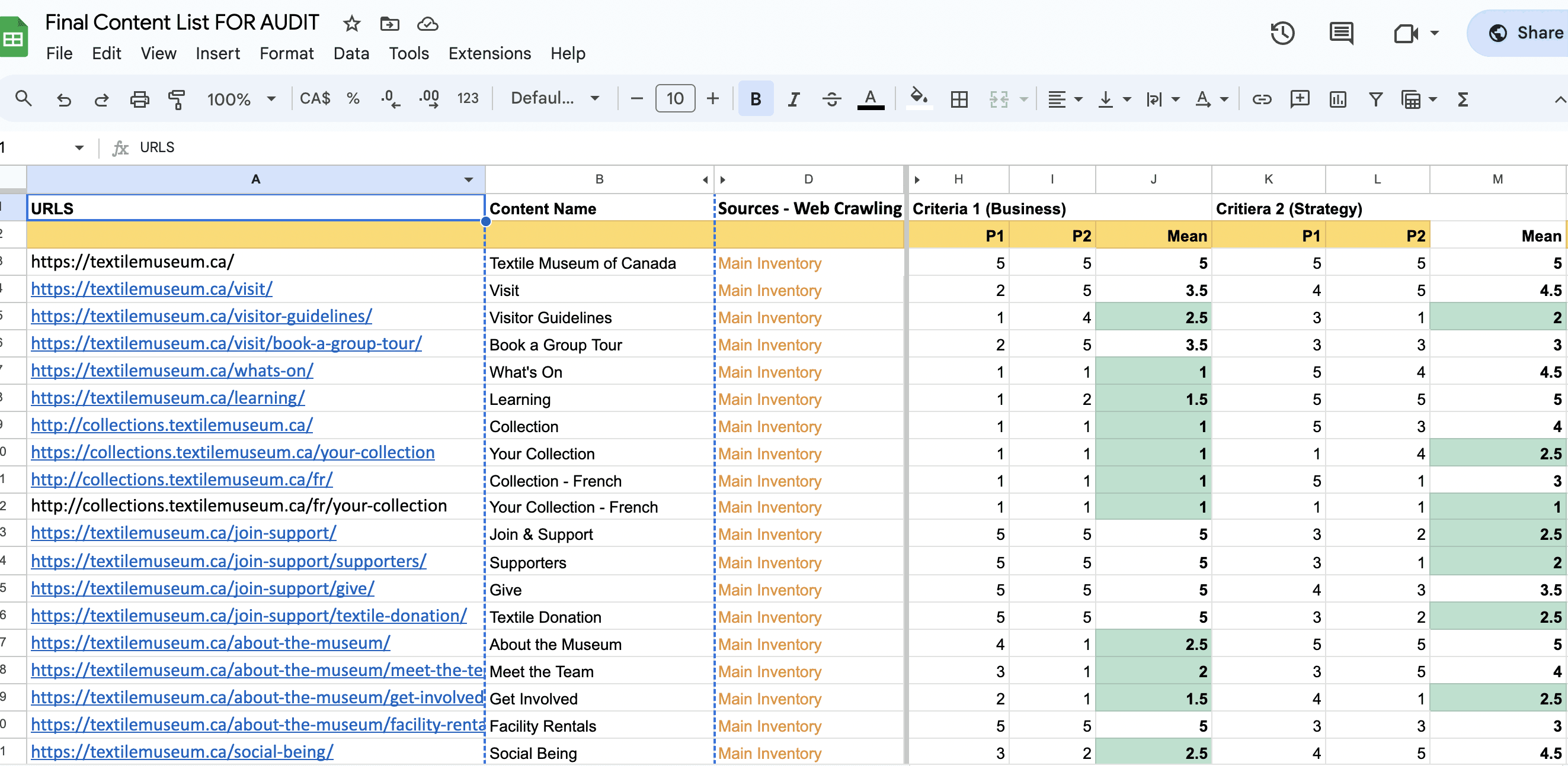
When auditing the content, two team members independently assessed each audited page, assigning a score (1-5, 1 = less relevant, 5 = most relevant) based on the criteria outlined above. The mean score of the evaluations was then used to inform our recommendation for the website's content.

Content Audit

Criteria

C

Business focused criteria
Connection to strategy and key message
User-focused criteria

How actionable/relevant the page

is related to the business related items

Attracting a larger crowd, particularly

marginalized individuals

How functional the website is

to support the tasks of the users

Analysis

Dividing up the Exhibits and Events into ‘current’, ‘upcoming’ and ‘previous’

  • help the user with easily navigating which exhibits or events they’re interested in

Review the pages ‘Contact us’, and ‘Visit us’

  • The information might be redundant

Remove the ‘Cloth and Clay’ page

  • The layout of this page does not seem to be very consistent with the museum’s branding style

Adding a dedicated Newsletter page

  • help individuals stay up to date with the museum’s latest updates

56

Cards


Key Insights

  • Narrow Target Audience Awareness: Acknowledgment that the Textile Museum's target audience is limited, evidenced by an ESL user's initial question about the meaning of "textile”.

  • Simplify Navigation Language: Use single verbs for navigation names and get rid of abstract terms.

  • Prefer Content Over Commercialization: Preference for informational content, like understanding textiles and viewing exhibition pictures, over commercial elements such as shopping options being the main focus.

  • Address Overwhelming Site Design: Observation of website overload, citing concerns about the excessive number of categories and links, leading to a distracting and overwhelming user experience.

Recommendations

  • Information Access: Conveniently access details about the Textile Museum, including exhibit information, admissions, and directions.

  • Newsletter Subscription: Stay updated on museum events and new exhibits by signing up for the newsletter.

  • Essential Information Accessibility: Easily find information on upcoming exhibits, admissions, directions, and fees for a seamless museum experience.

  • Newsletter Sign-Up Link: Enhance user experience by providing a clear link or page for newsletter subscription.

  • ESL Explanation of Words: Offer clear explanations for English as a second language users to understand words such as "textile."

  • Admission Fee Clarity: Ensure a transparent understanding of admission fees for a straightforward visitor experience.
8

Participants


Open Card Sorting

Monitored Session

  • 30 mins

  • In person / Zoom

  • Tester observed process and provided instructions

Followed-up Questions

  • How many categories do you see at first glance?

  • Do any of the cards not make sense to you?

  • Are there any cards that you think are missing?

  • Which card is the easiest/most difficult to sort?

  • Have you ever been to a museum?

  • What’s the first thing you look for OR do you think you would look for when you visit a museum website?

  • Do you think the final results can help you know the textile museum better?

Open Card Sorting Insights / Recommendations

3.

2.

1.

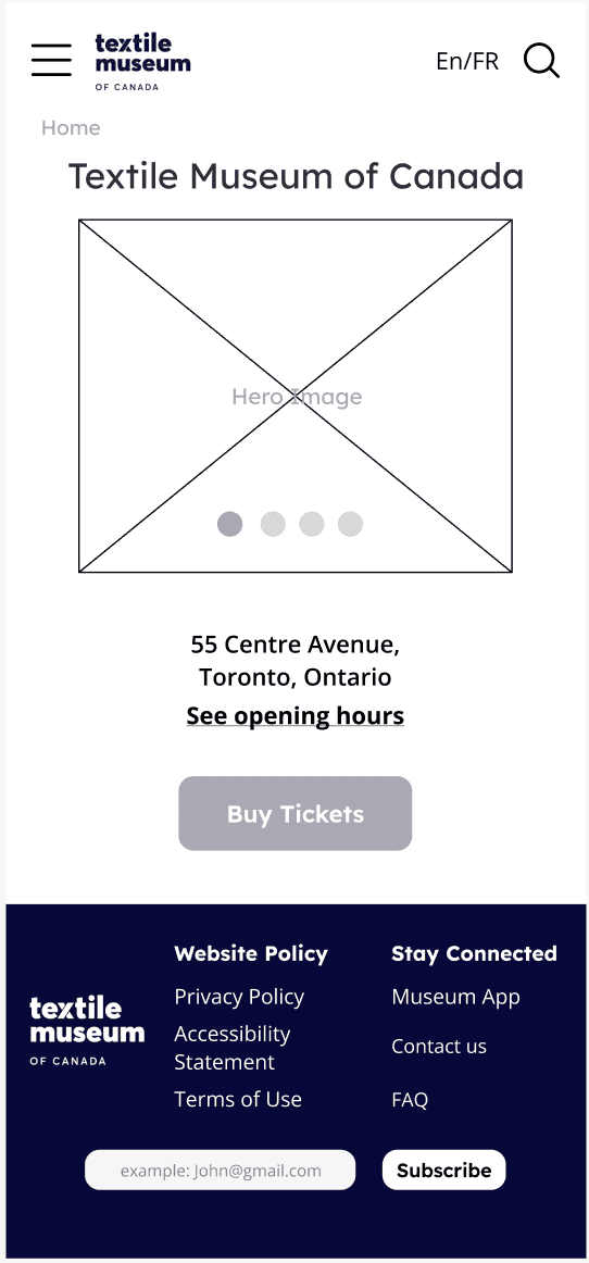
Current Mobile Website

Current Desktop Website
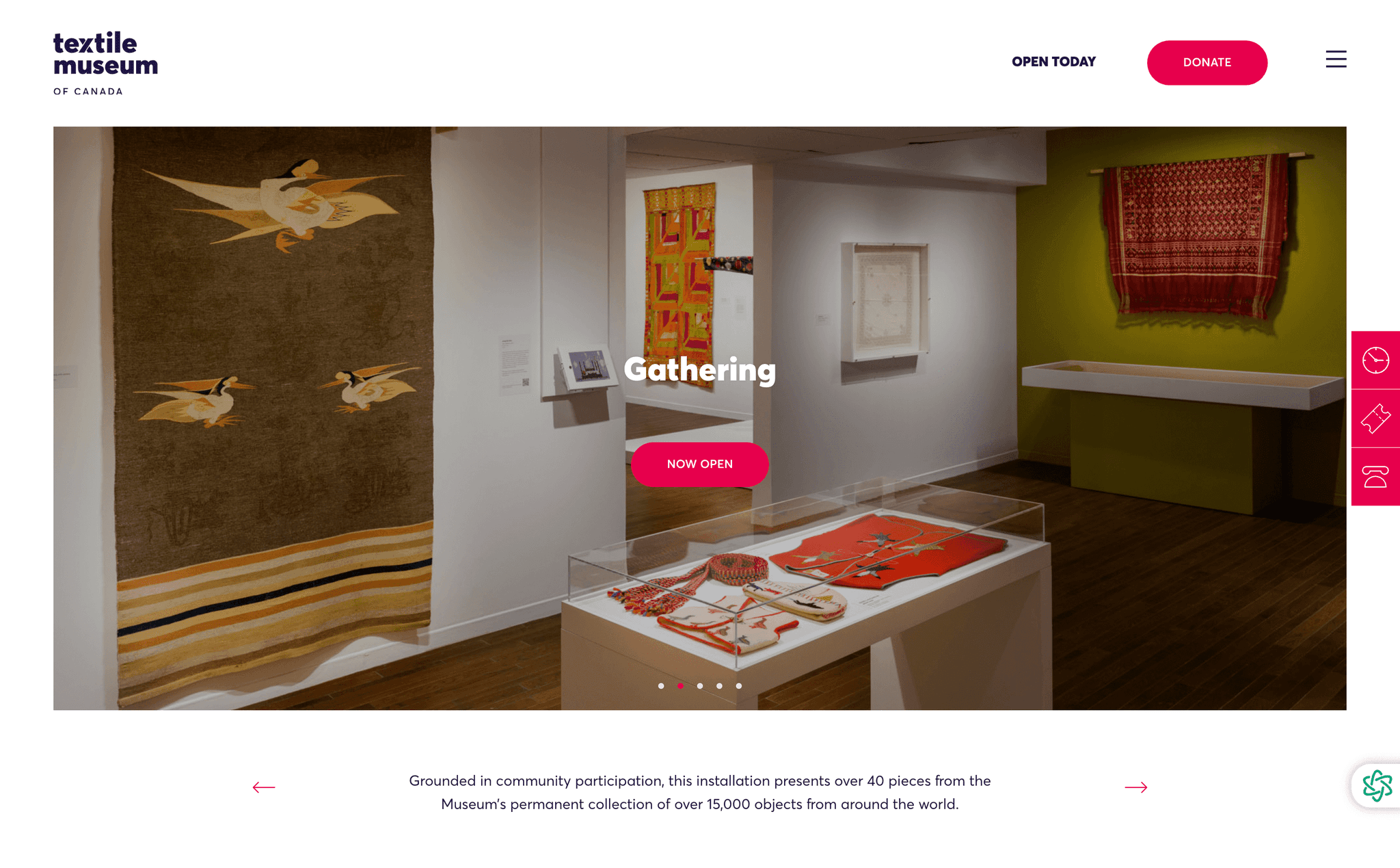
Current Website Gap
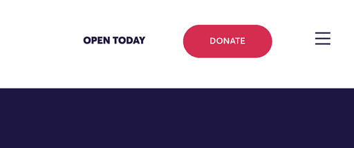
Current footer contains a lot of information which is overwhelming to the user

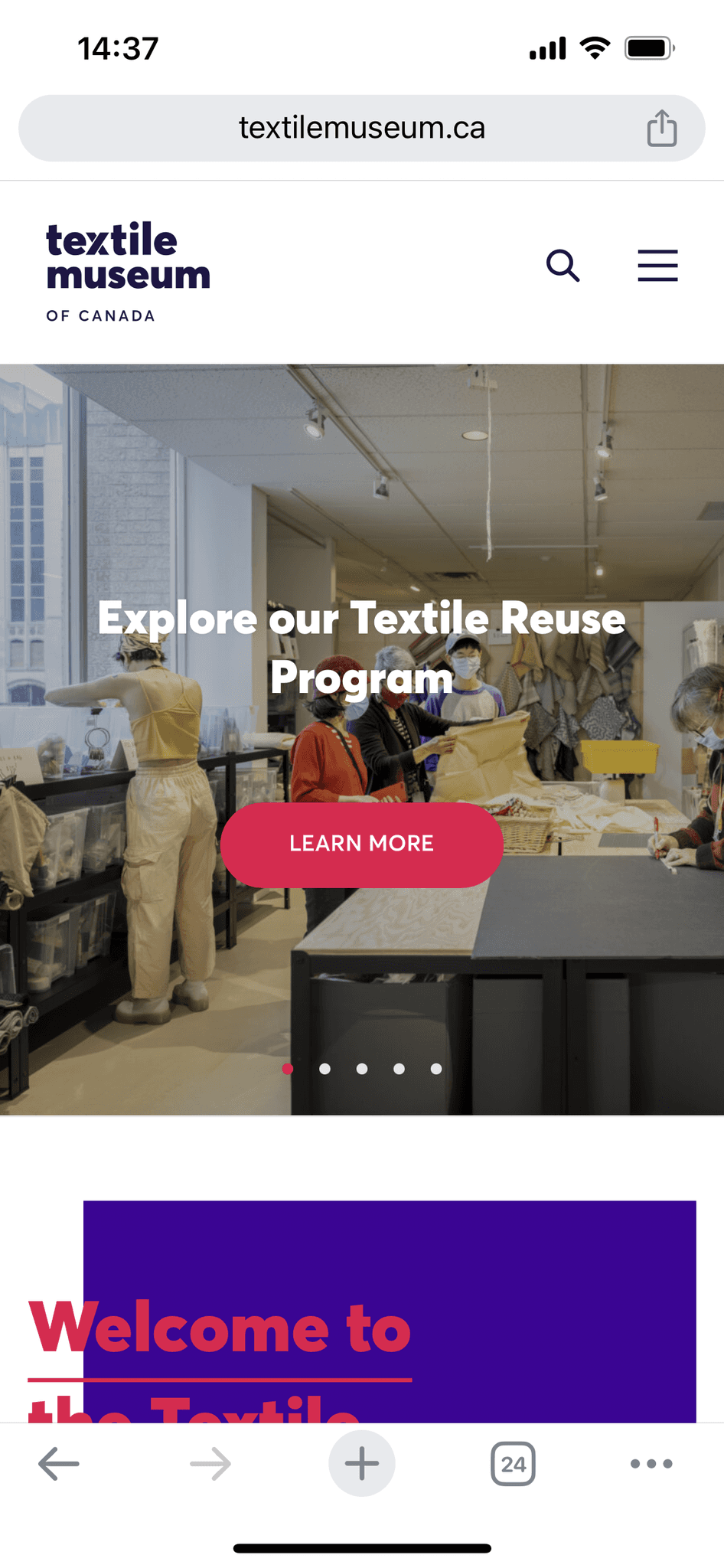
Hamburger menu hides important information from the user

Language used for the current pages is too vague
3.

Use clear and straightforward language

2.

Simply footer and move 'Visit' to primary navigation only

1.

Remove the hamburger menu for the desktop and condense the numerous categories

Our Solution