团队
胡贝贝,埃莉兹·汗,
侯晓涵,舒米拉·兰吉斯
埃莉兹·汗
侯晓涵
舒米拉·兰吉斯
团队
胡贝贝,埃莉兹·汗,
侯晓涵,舒米拉·兰吉斯
埃莉兹·汗
侯晓涵
舒米拉·兰吉斯
团队
胡贝贝,埃莉兹·汗,
侯晓涵,舒米拉·兰吉斯
埃莉兹·汗
侯晓涵
舒米拉·兰吉斯
团队
胡贝贝,埃莉兹·汗,
侯晓涵,舒米拉·兰吉斯
埃莉兹·汗
侯晓涵
舒米拉·兰吉斯
WanderSafe 是一个基于地图的手机应用程序,旨在增强多伦多女性的步行通勤体验。它解决了女性面临的挑战,例如在地图上确定最安全的路线,危险时迅速找到安全点,以及接收实时警报。设计灵感来自我们女性组员在多伦多的负面通勤经历。
#Efficiency
#Quality
#Work optimization
#Relevancy & personalized
The vision of IKEA Content Space is to create an integrated digital content platform for IKEA that combines text, pictures, and motion seamlessly, allowing for personalized and localized content experiences.
Explore Content Space
Content
Gallery
Content
Management
Content
Creation
Performance
Monitoring
….

How might we
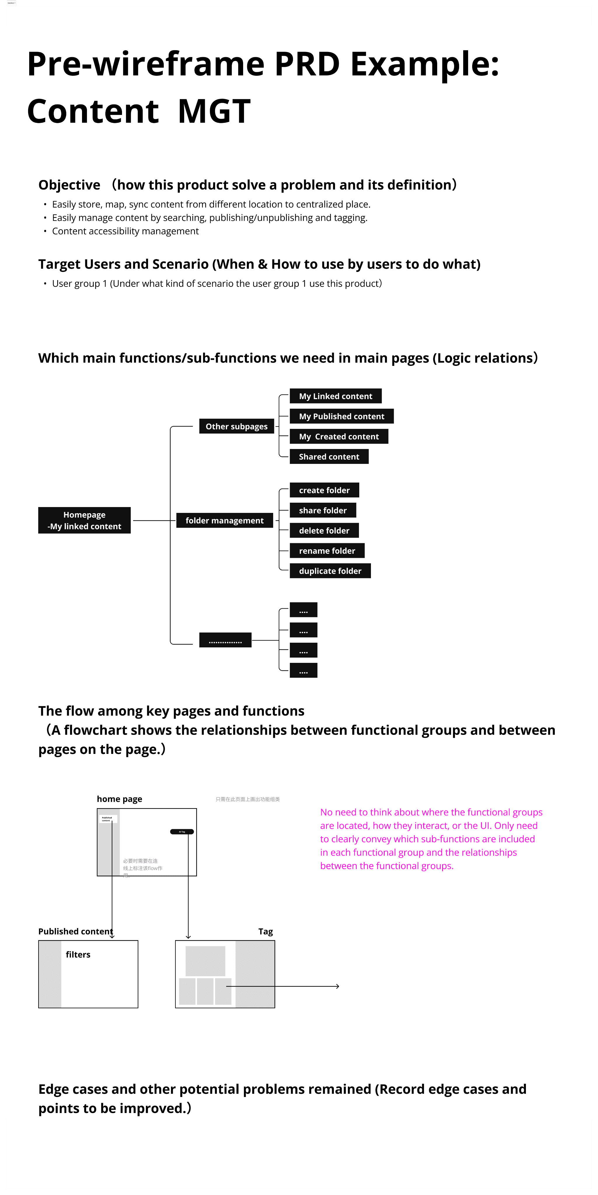
Build a platform to provide IKEA(CN) staffs with a streamlined, one-stop solution for addressing these issues and utilizing AI to enhance their efficiency?
Wandersafe
2023,UX设计学术项目
the design solutions
View
Communicate with the Product team to understand the product's application scenario and business scenario.
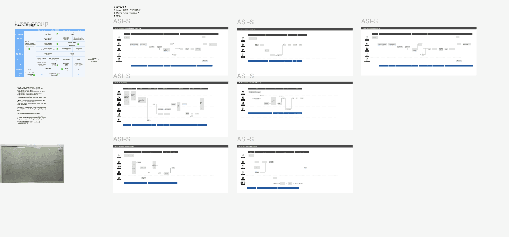
Organize the previous user interviews with variety of users in different business scenarios, and redesign the user journey map.
Conduct usability testing with potential users.
Brainstorm the potential design solutions with the team .
Continue to iterate design based on product's performance and users' feedback.
Design Process
Incorporate business value into UX
UX for B2B varies greatly
UX localization
Personal Takeaways
Within a large-scale retail corporation, our ultimate objective consistently remains to increase product sales whilst conserving time and money. Each UX strategy should factor in the financial and temporal implications.
B2B UX design is more practical and efficient. We don't have enough time to conduct user research but we still need the ability to grasp users' pain points in a limited time.
While designing, I spent a lot of time discovering the differences between European and Chinese users, as well as the differences between European and Chinese business scenarios. Only a UX design that meets local users' habits and expectations can achieve good results.
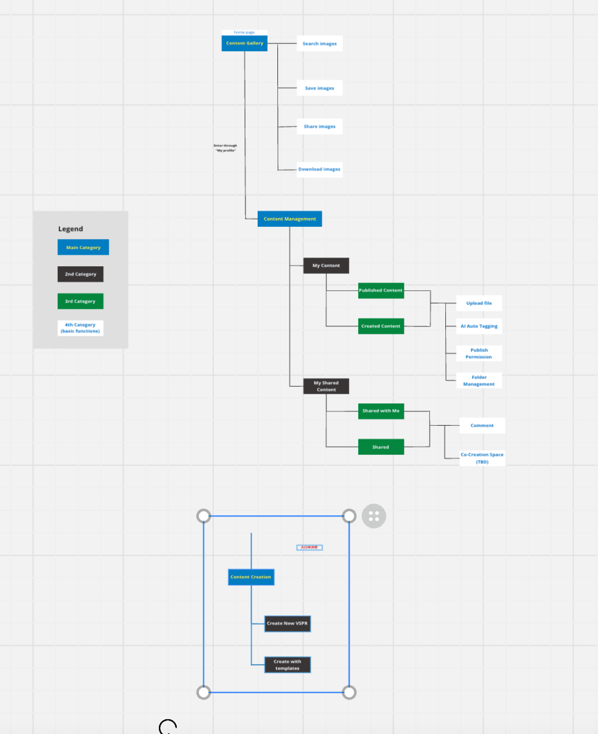
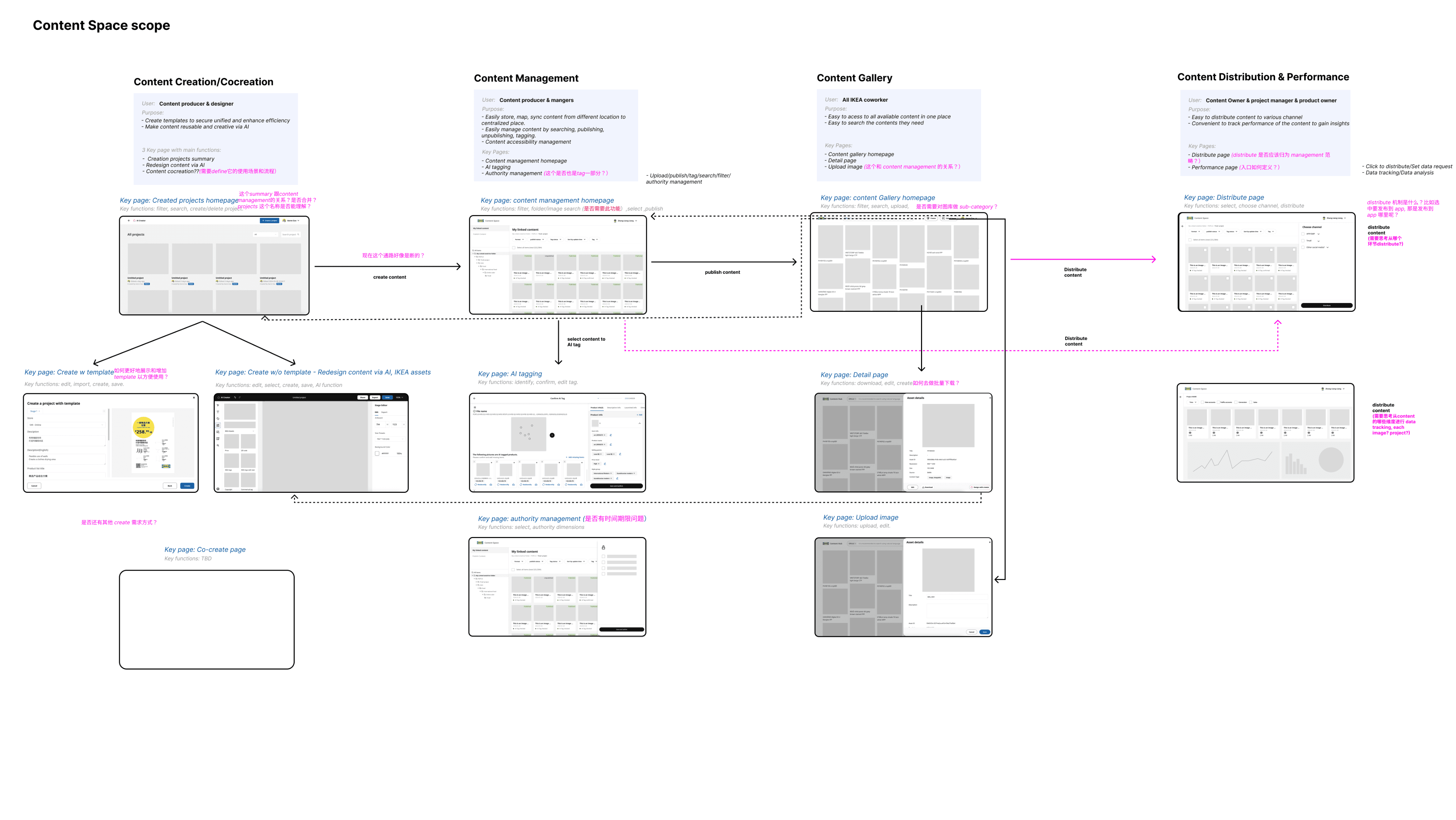
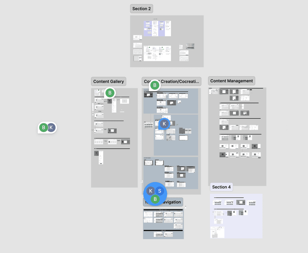
Given the extensive breadth of Content Space, every page encompasses diverse features. During the development of user flows and based on the Product team's PRD documents, I clarified the information architecture of Content Space, providing a clear vision of the entire scope to the UX team, Product team, and engineering team.
We met the problem in the very beginning
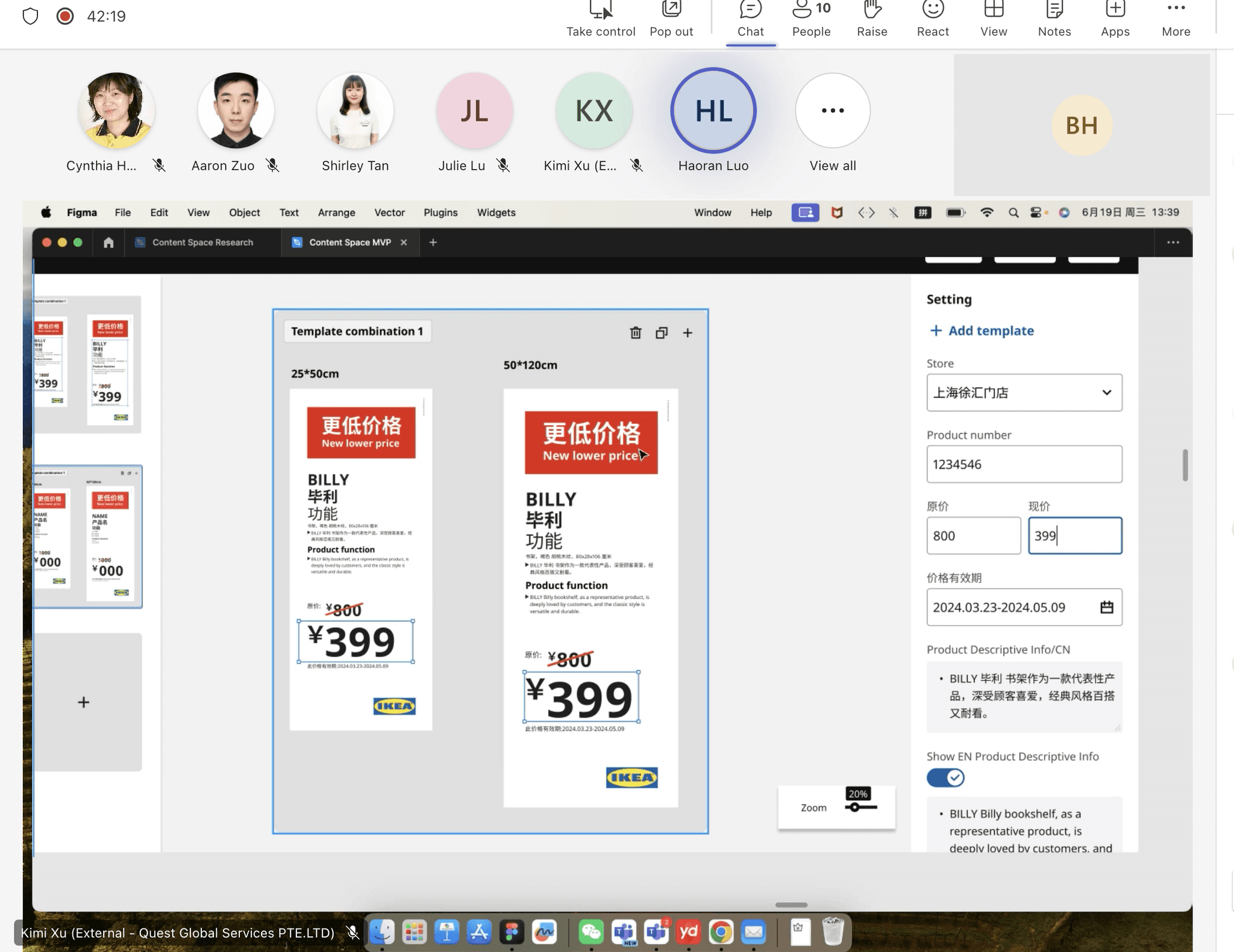
“I prefer the one with the template pictures since it looks more intuitive to me when choosing templates.”

“I think the last version looks better because it can reduce our training time to our new staffs who don't know templates before. ”

Hear real users' feedback through testing sessions
We conducted usability testing sessions with IEKA in-store staffs to know about their feelings towards different design versions, which helped us understand more thoroughly about their working scenarios and continue to iterate our design.
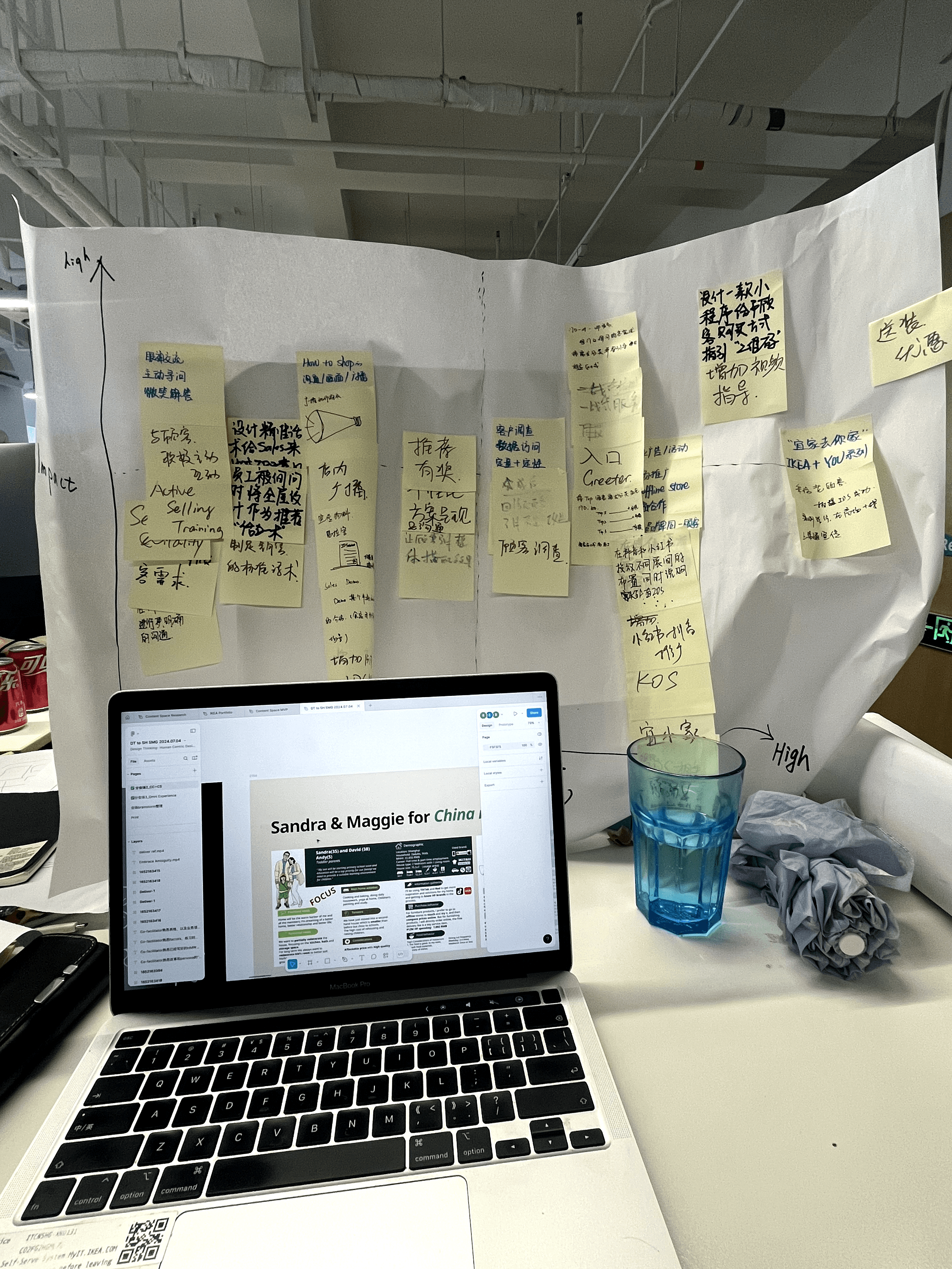
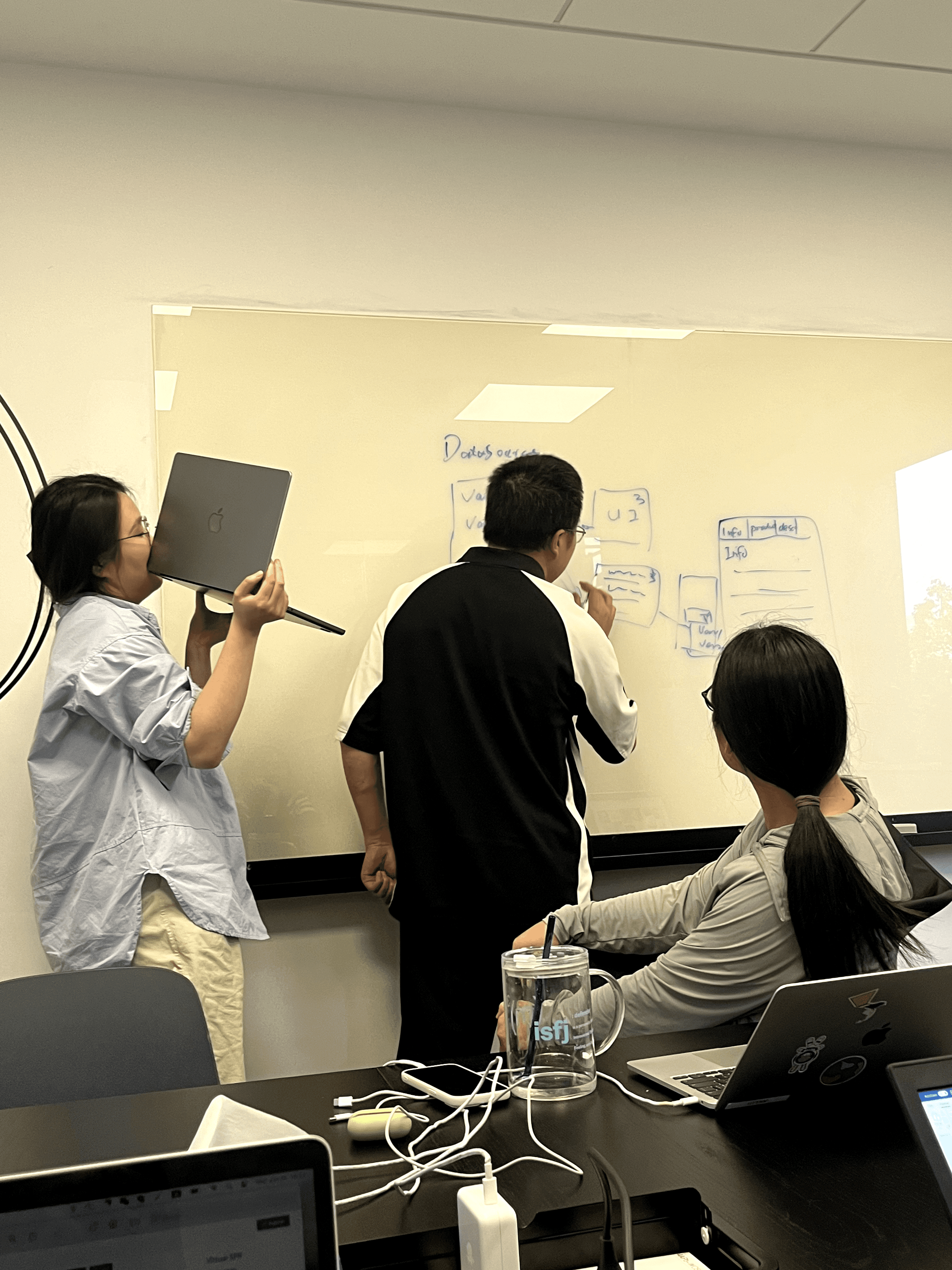
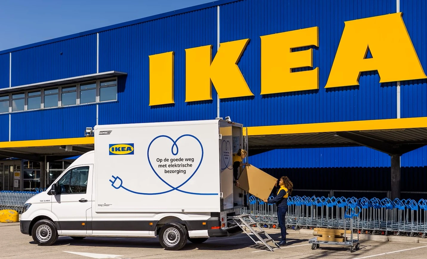
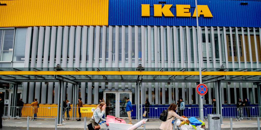
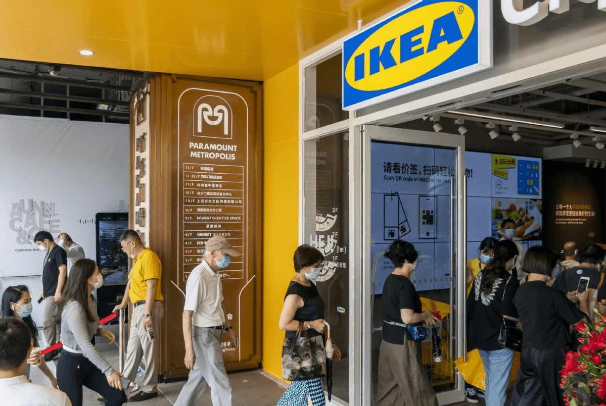
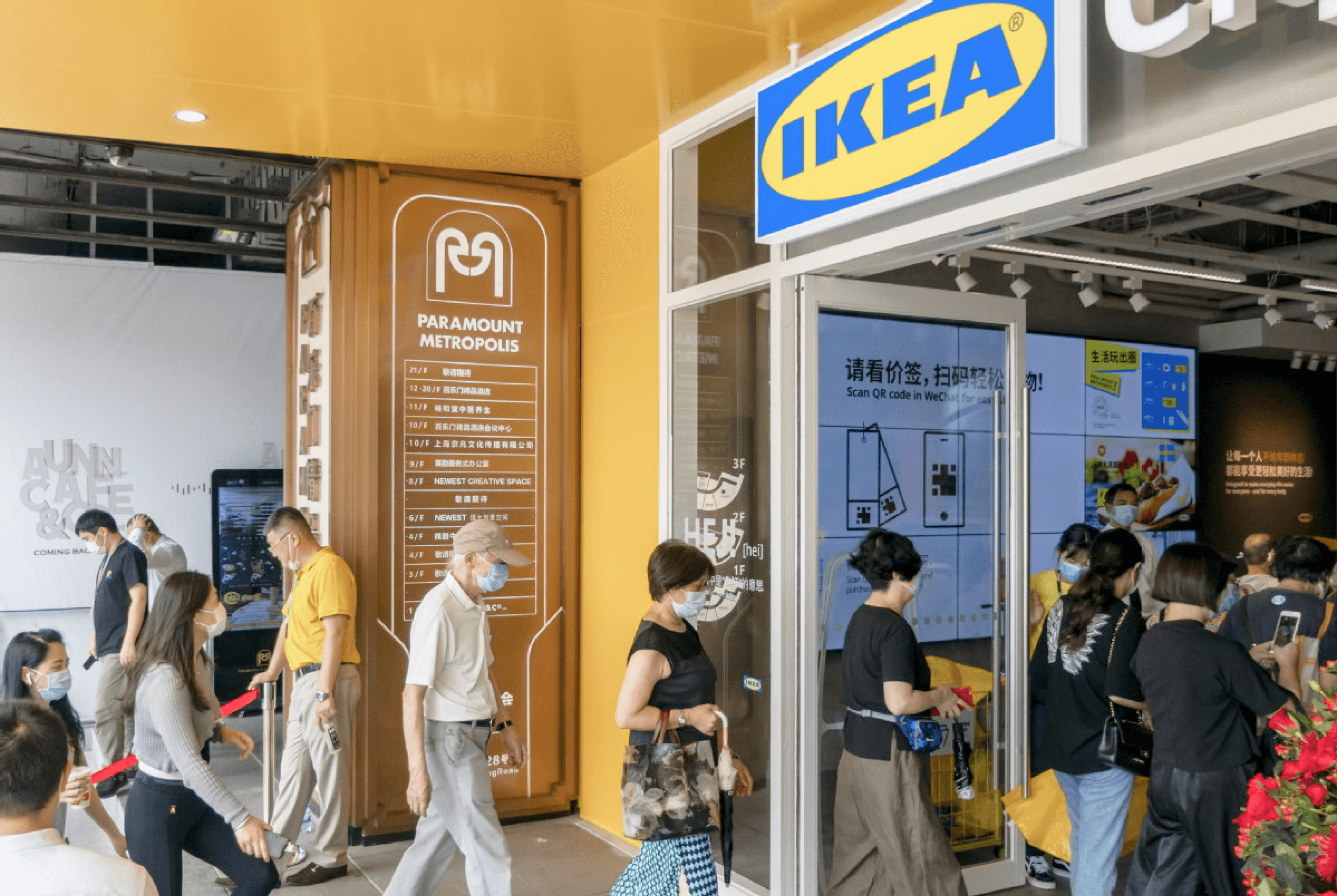
Some photos about my time at IKEA!

Thank you for scrolling!
Interested in more design details? 😉
View Design Thinking process >
Inefficient review and feedback mechanism of created digital content.
3

1
Too much digital content stored in different IKEA vendors' drives, "We don't own the source of truth".
Inconvenient content search and management (including design outputs, briefs, and local assets).
2
IKEA employees are currently meeting…
4
Challenging to enhance online material's excellence and productivity.
We tried to cleared out product's different using scenarios and empathized with our users through extremely complicated user journey
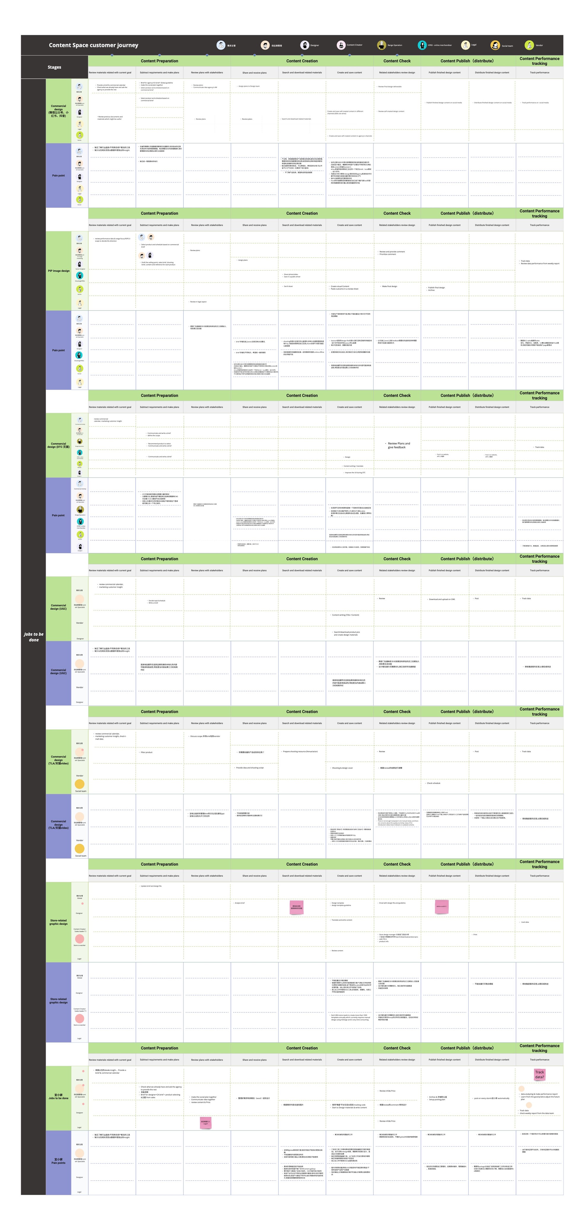
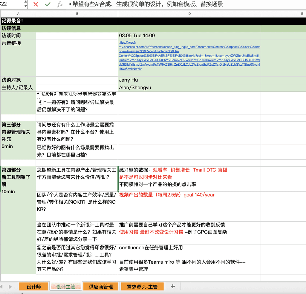
After reviewing previous user interviews conducted by other designers and product managers, we realized that there are many specific working processes we do not fully understand. Additionally, the target users for the content space are too diverse. As a result, we decided to create a more comprehensive user journey map which includes 9 typical users in 7 business scenarios to identify more design opportunities and uncover gaps between our understanding and the users' actual usage scenarios.
Communicate with PMs, Engineers effectively
At the beginning of the project, we encountered communication problems with our PMs because their internal objectives sometimes didn't align with each other. Occasionally, the needs within the PRD were unclear, and some of them overlapped with the working duties of the UX team. As a result, we often spent a lot of time discussing the details in the PRD, which wasted valuable time. I proposed that we should reduce the time spent arguing to increase efficiency. To resolve this situation, I provided a PRD example that included the details the UX team wanted to see, which later greatly improved communication and working efficiency between the UX team and the Product team.
To ensure our engineering team fully understands our design, I provided clear text explanations within the user flows. We used Jira and Confluence to assign tasks, ensuring both the UX and Engineering teams could complete independent and collaborative tasks on time. Additionally, we adjusted our design whenever the Engineering team identified potential technical issues.
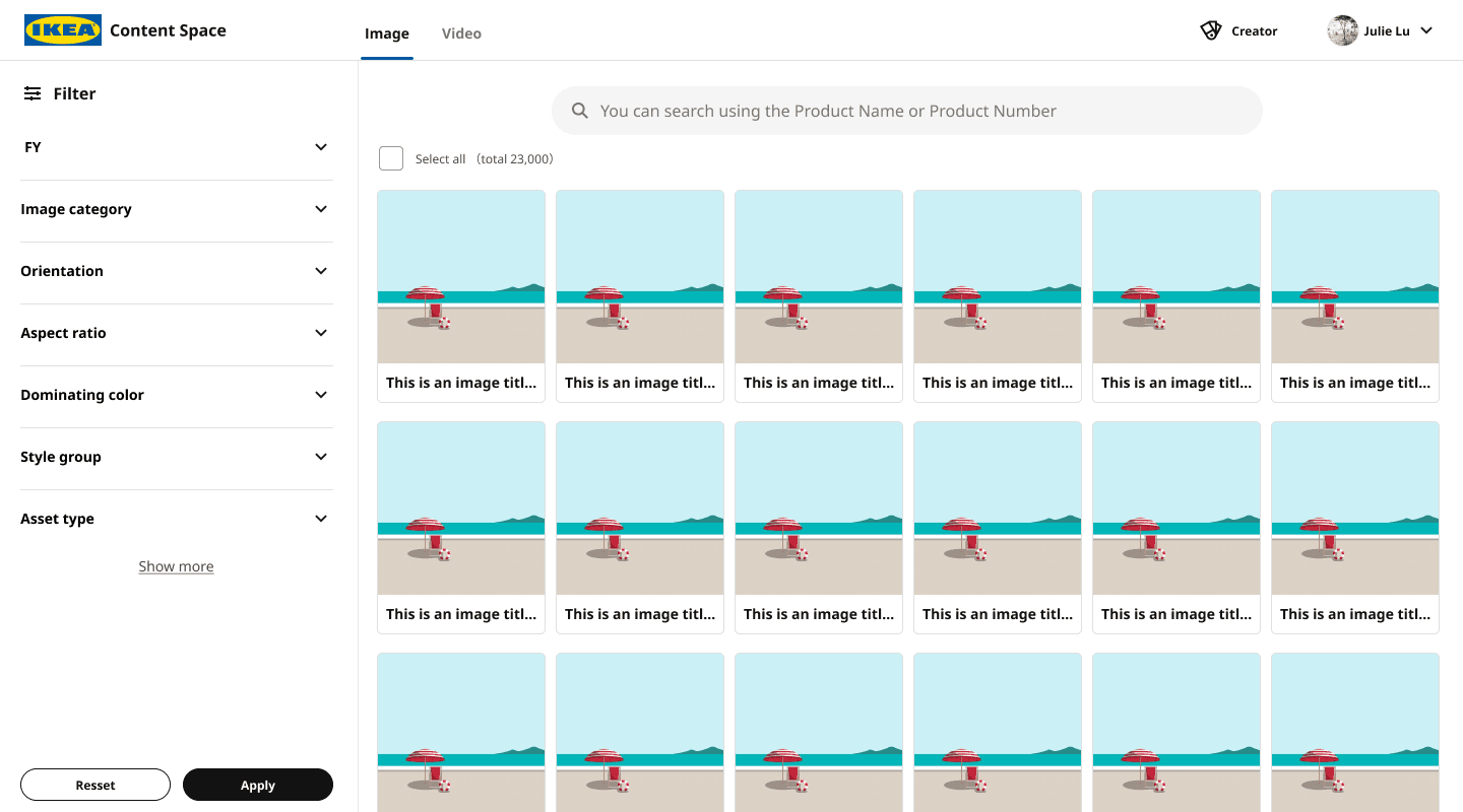
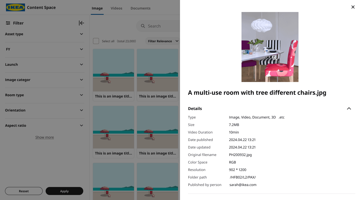
Content Management
Asset Gallery
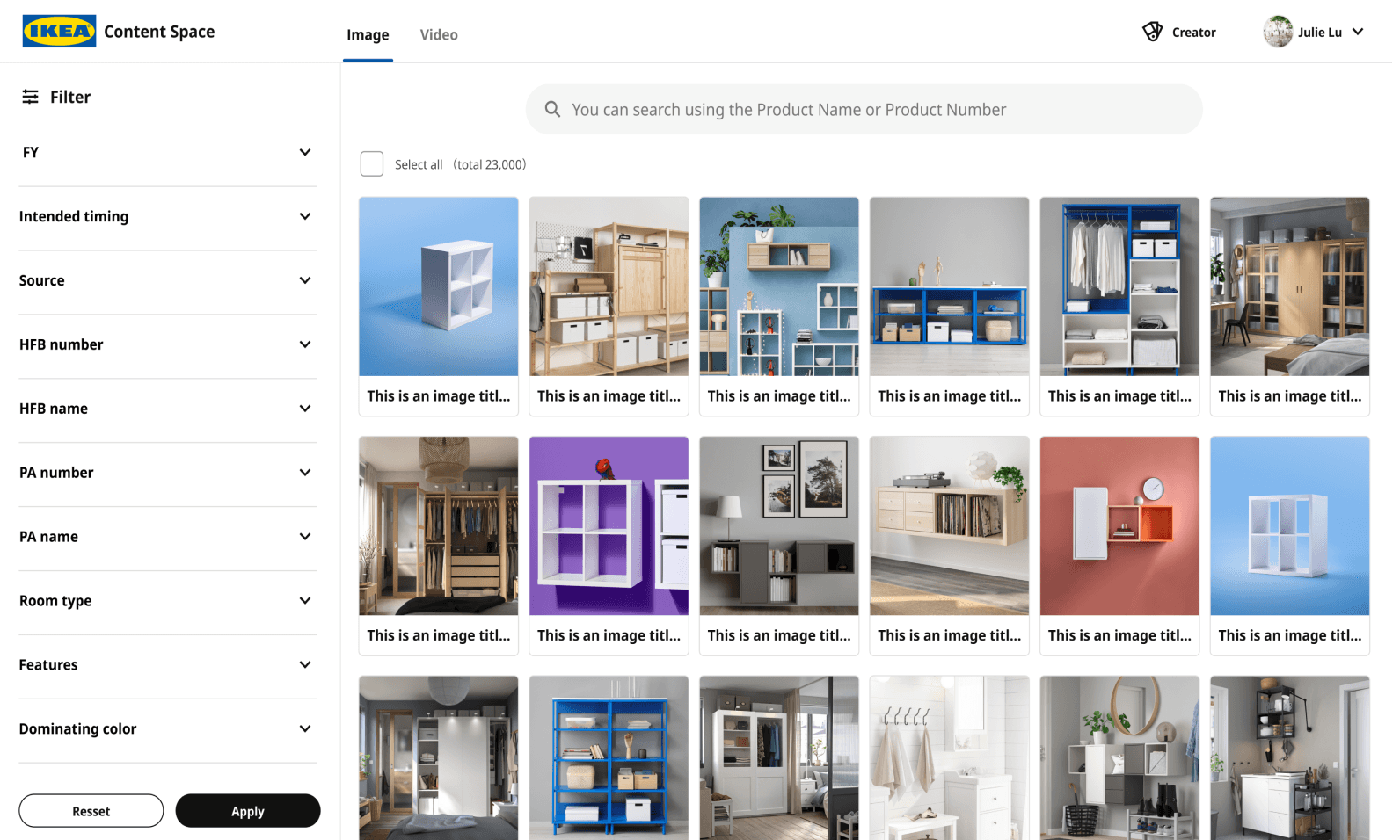
Find out suitable documents for marketing, advertising, and UX design use with ease
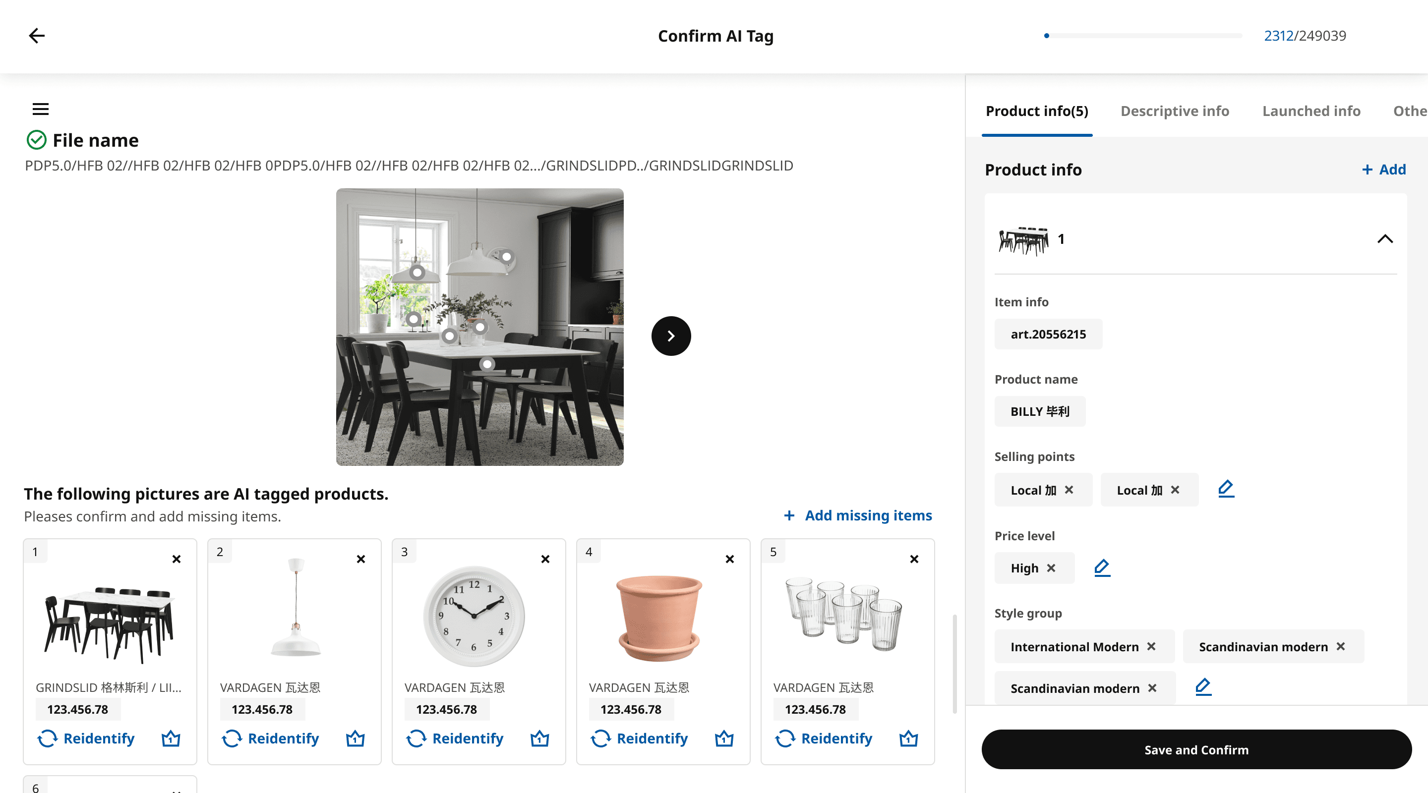
Content Management
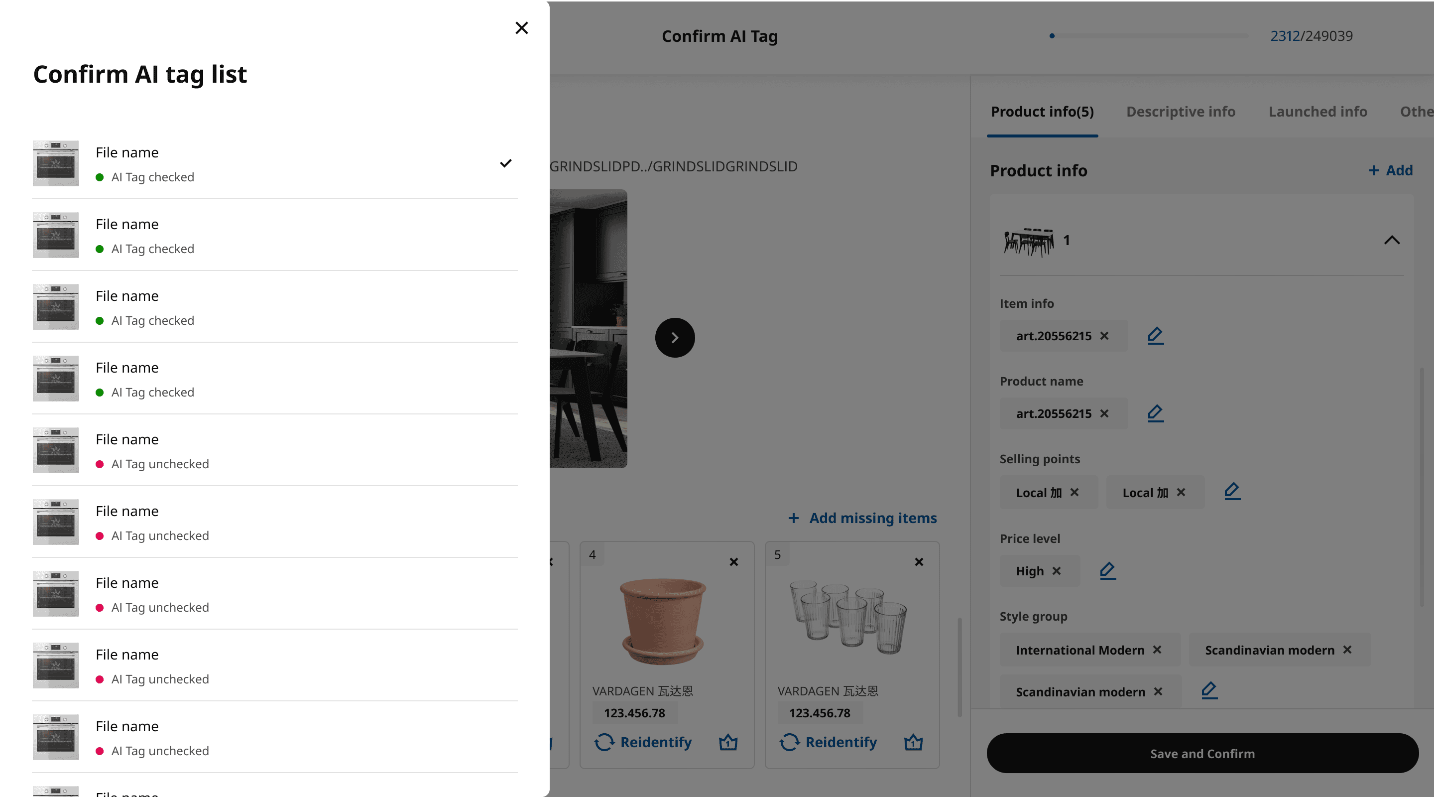
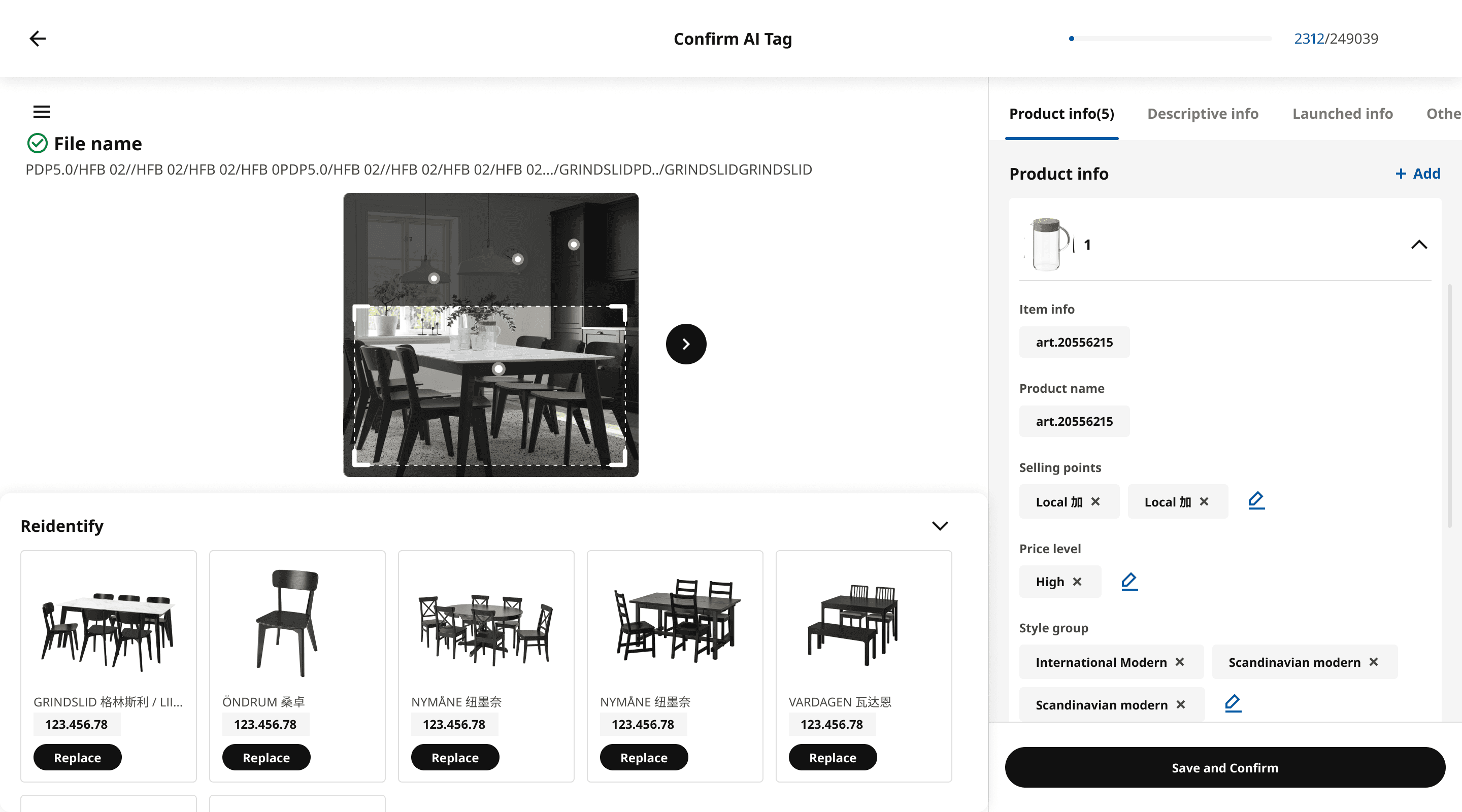
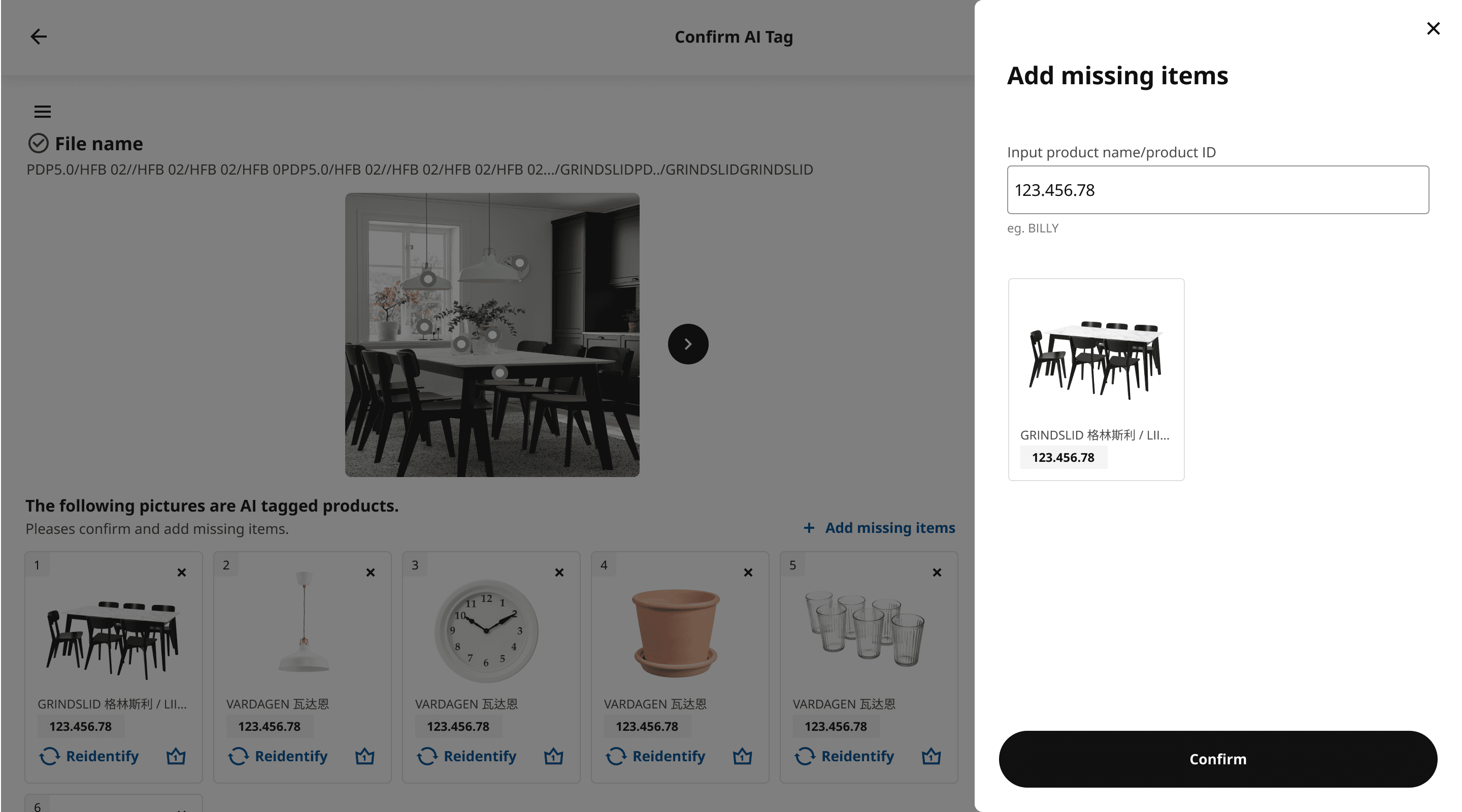
AI Auto-Tagging
Identify IKEA items and automatically tag commodities on images by using AI to improve employees' efficiency
Content Creation
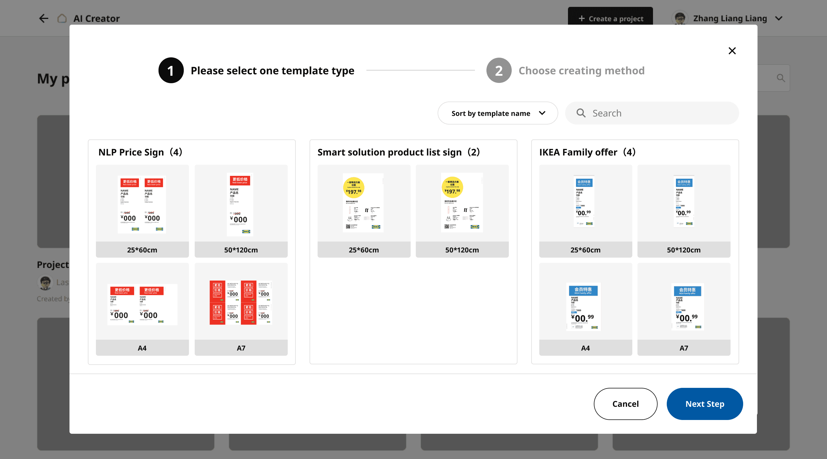
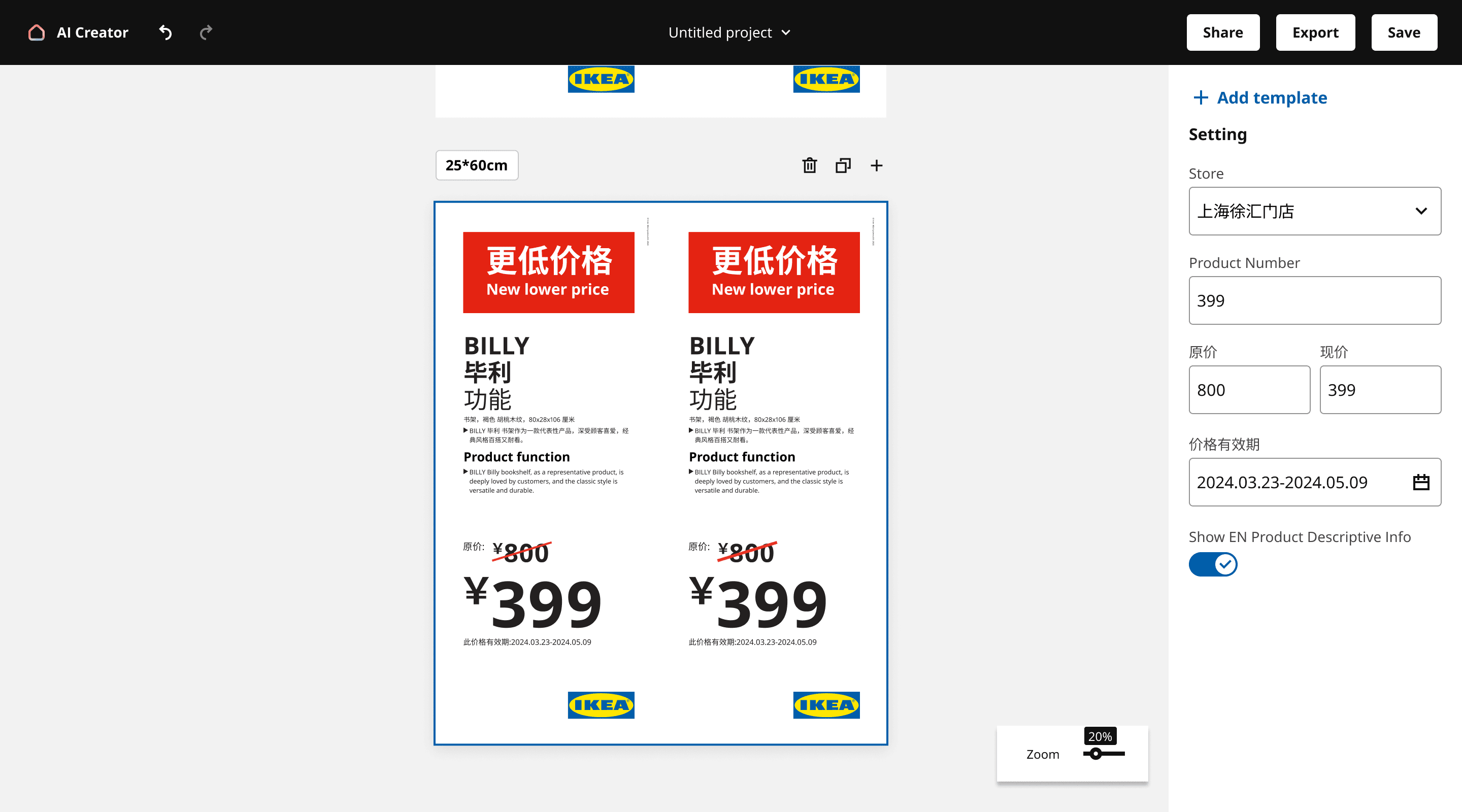
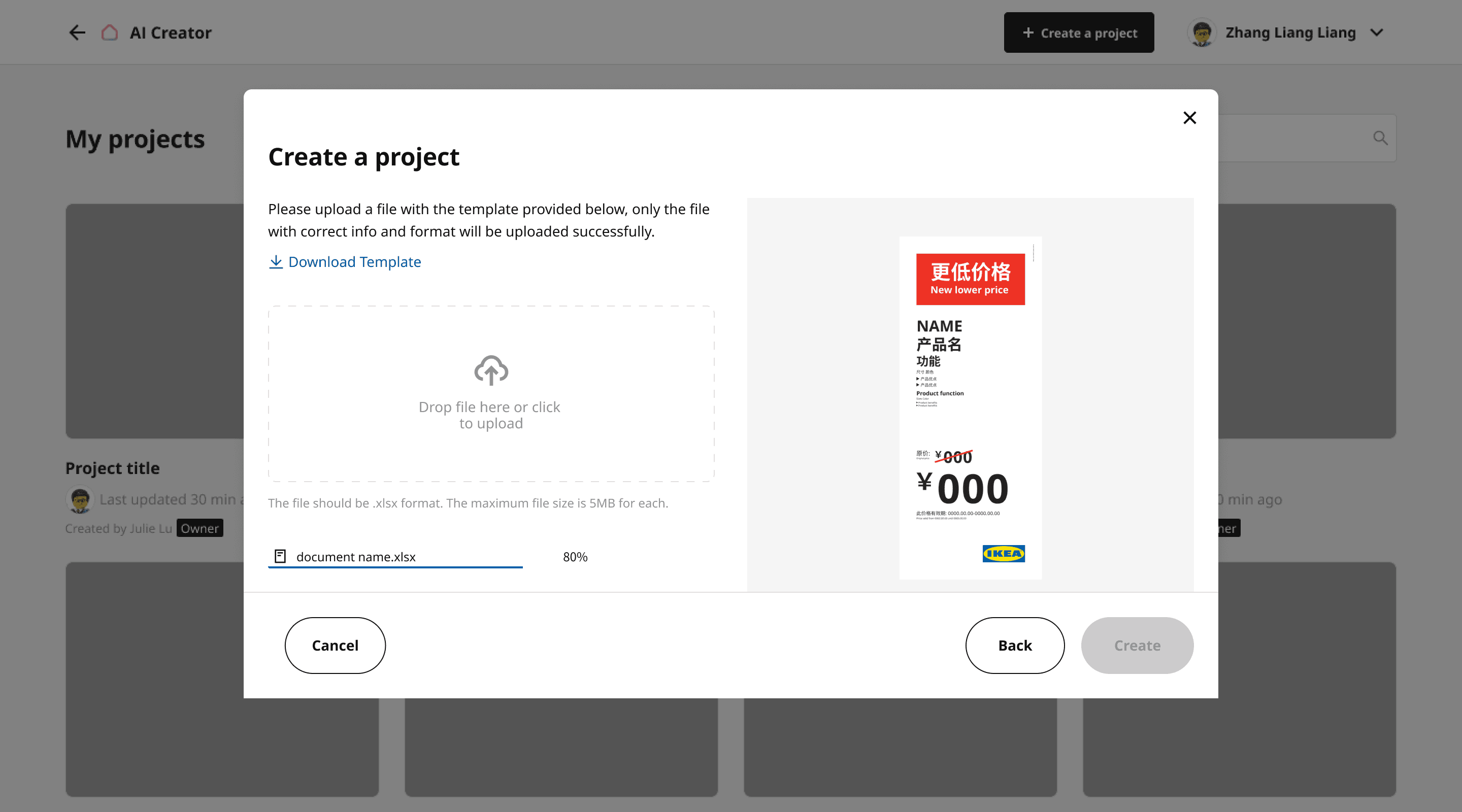
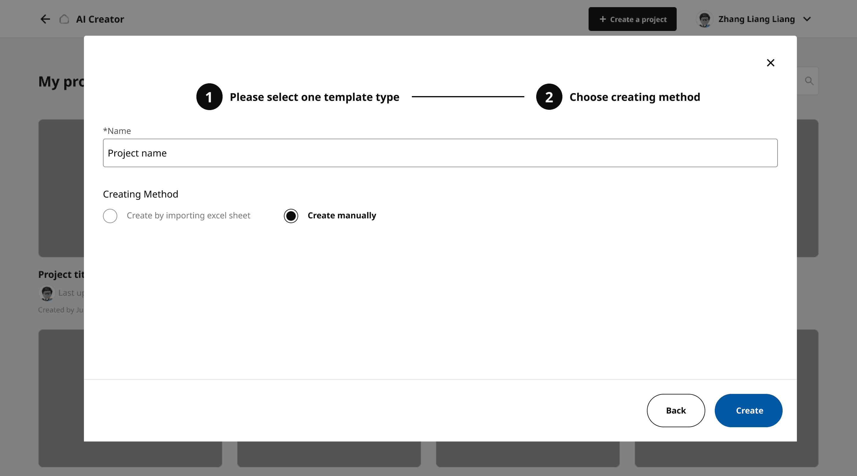
Template Creation
Produce thousands of price tag templates during different financial seasons in one minute by entering Product ID to save in-store staffs' time
Other Design Decisions
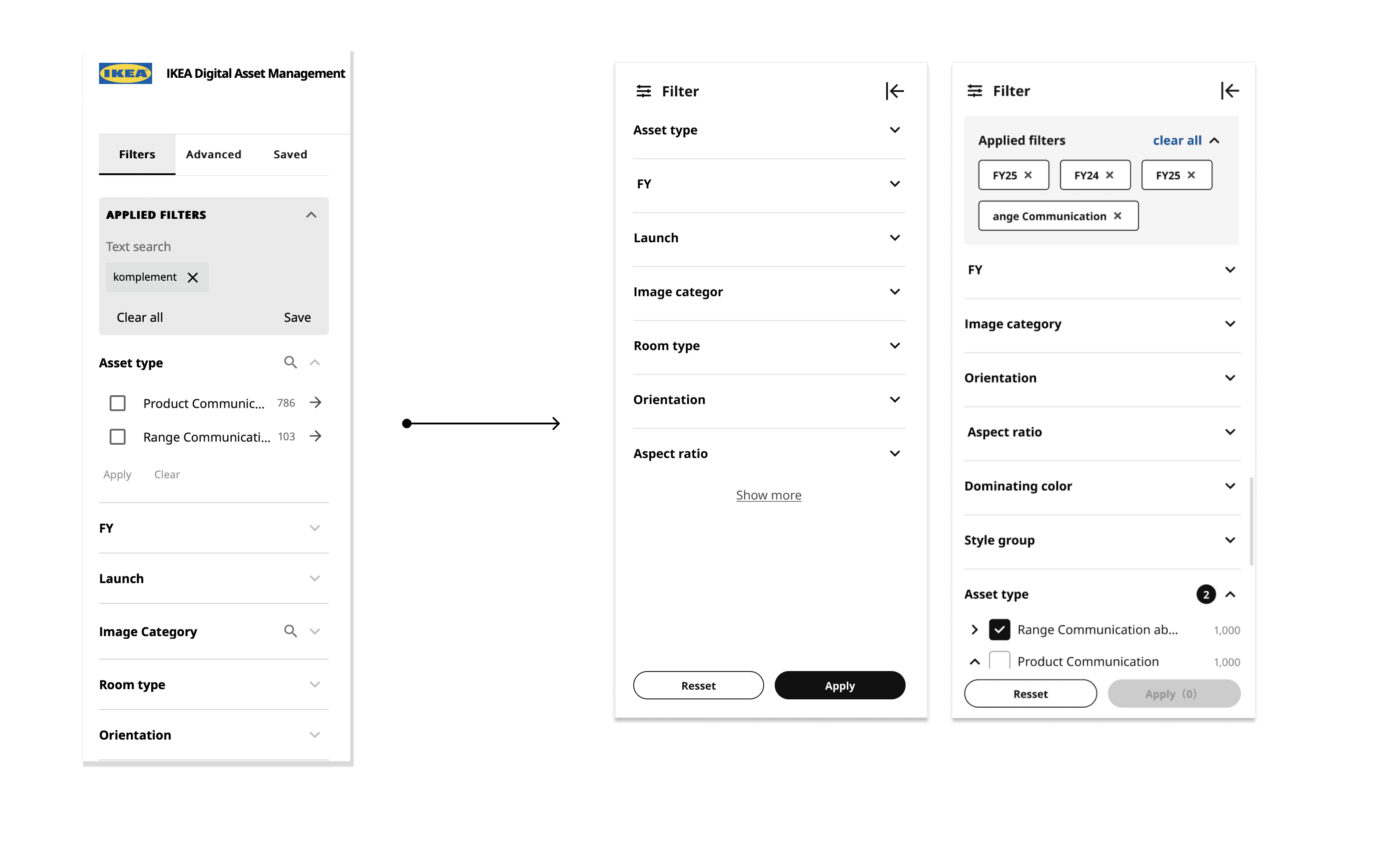
Shortened the filters visible to users and displayed them based on the priority of the business scenario. Users can also see how many filters they have selected in each category, and don't need to click on "Apply" every time after select the filter.
Deleted unimportant functions from the card and hided actions until hover to provide users with a simple and clear visual experience.
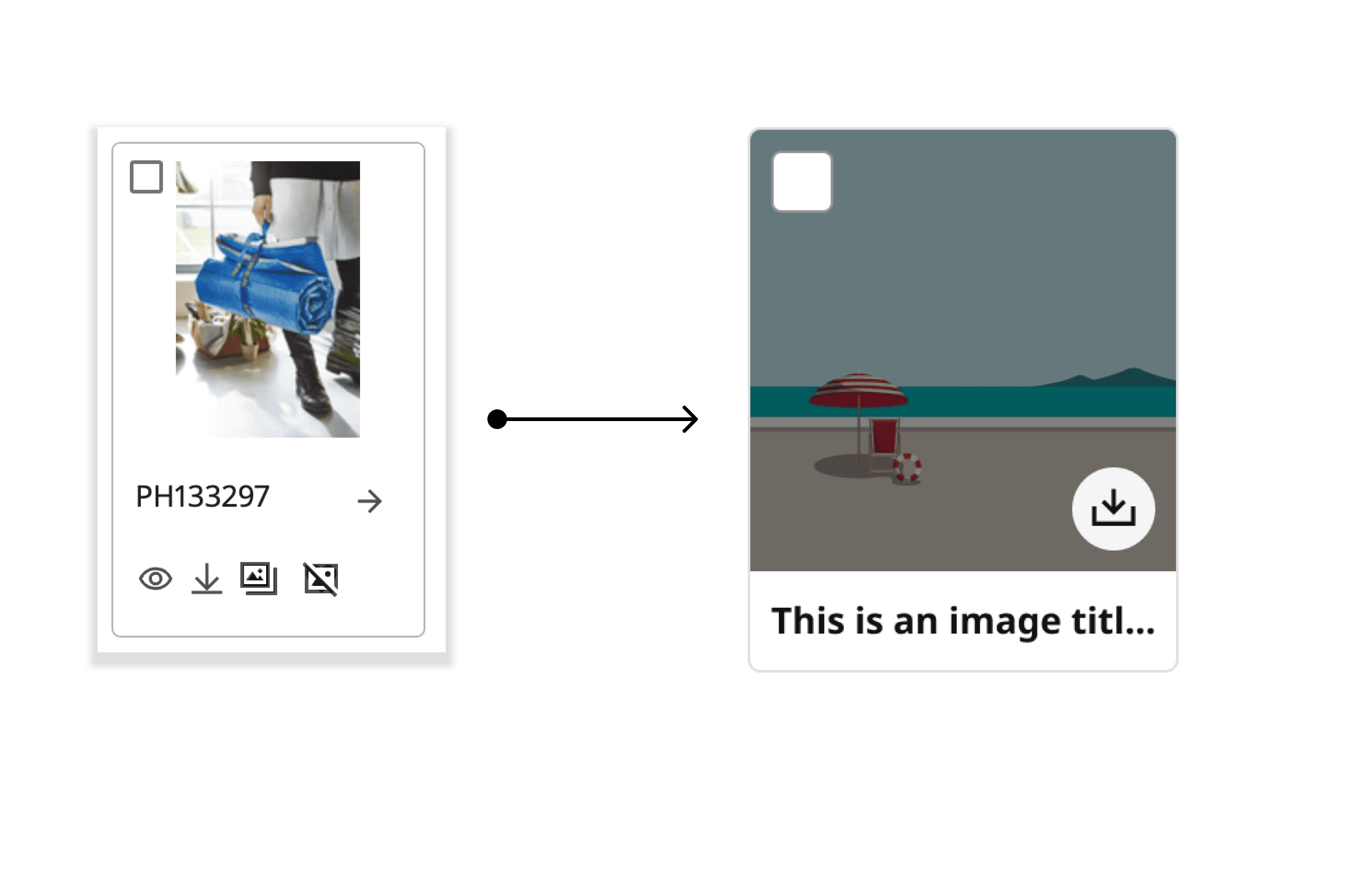
02. Simple and Clear UI
01 New filters to increase users' search efficiency
Moved unnecessary or less important functions from the header, and grouped similar functions together under users' profile to make a concise information architecture.
03. Straightforward Header

Improved the UX writing of instructions in both English and Chinese to make it easier and quicker for users to navigate the interface.
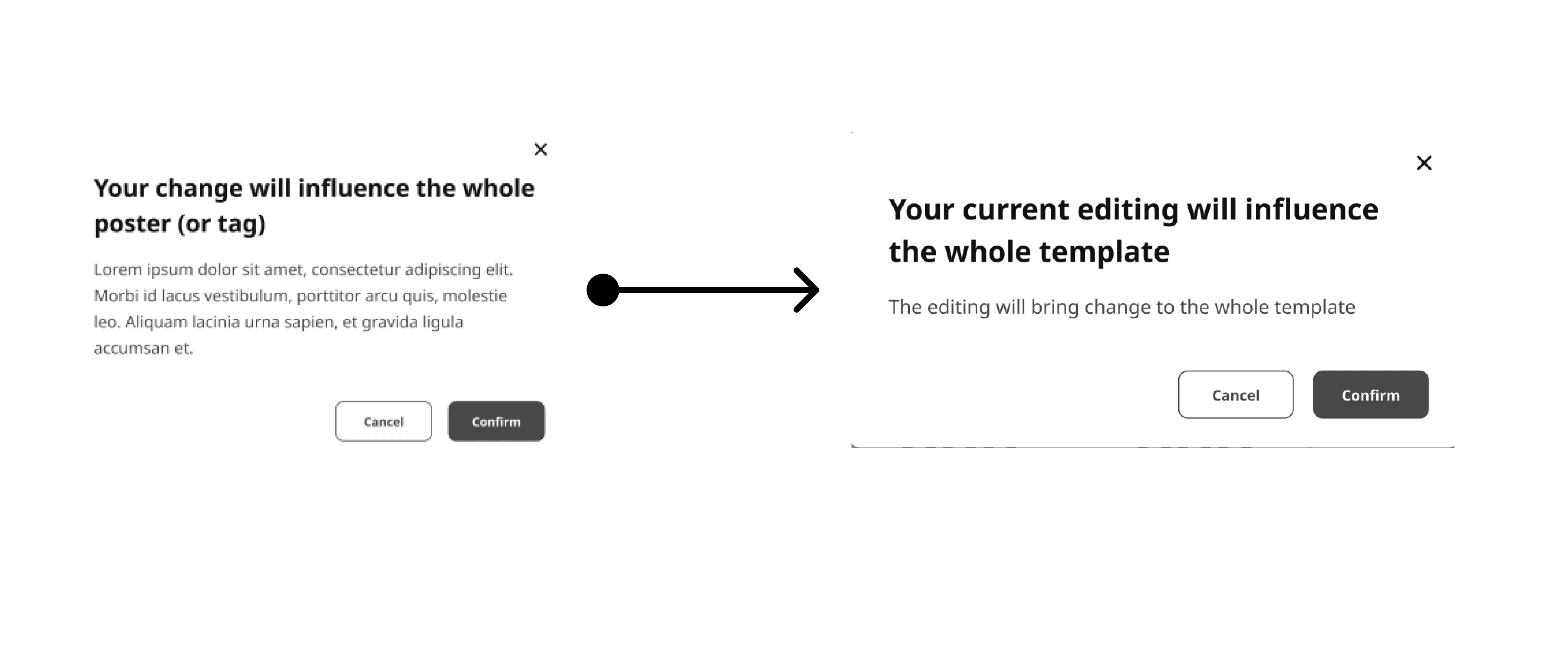
04. Improved UX writing
Continue to iterate based on users' feedback, business direction and challenges
We've experienced a lot of discussions, brainstorms, and meetings to transfer the wireframes to final MVP deliverable. For example, the NLP template designs have adjusted 5 times due to technical issues. We used sprints to divide different iterations in different stages, so that the engineer team can continue to improve on the product.
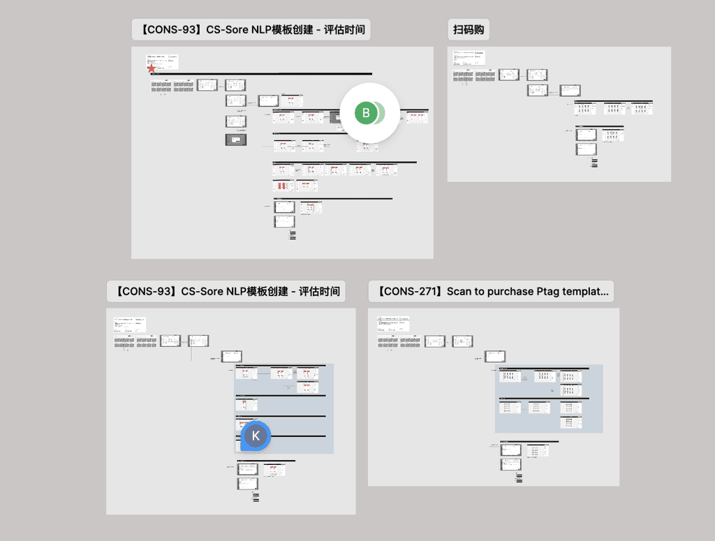
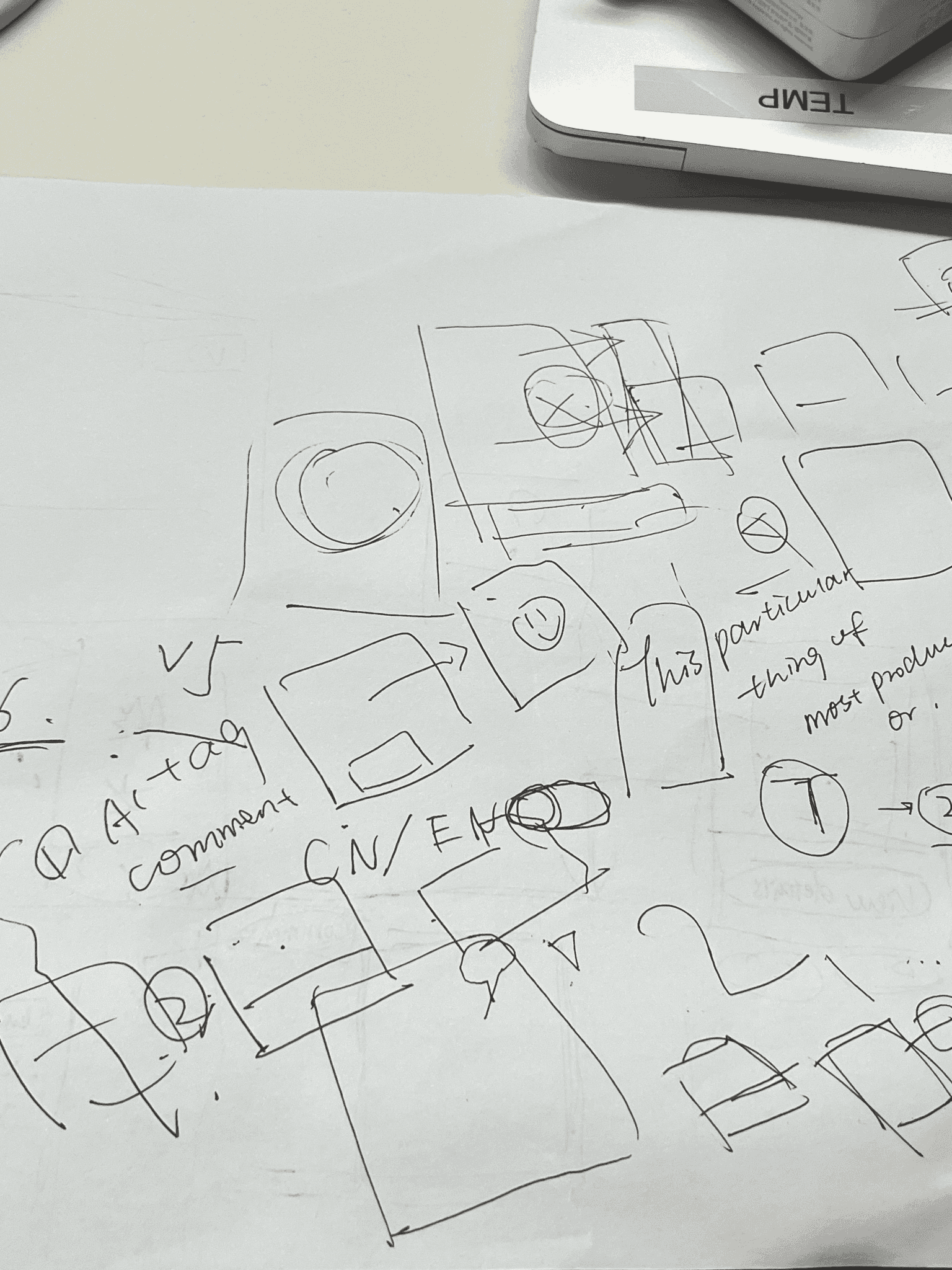
Sketches
Wireframes
MVP delivery
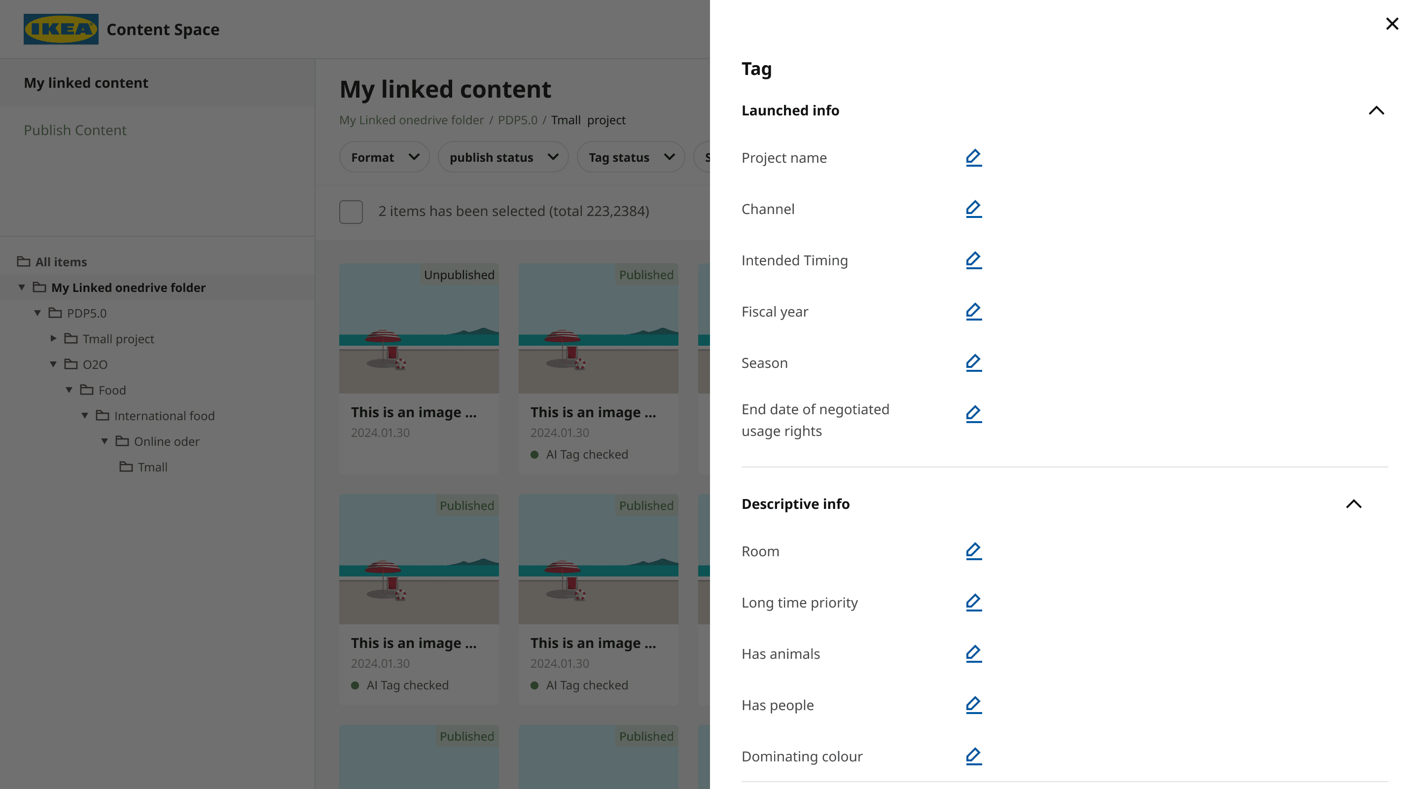
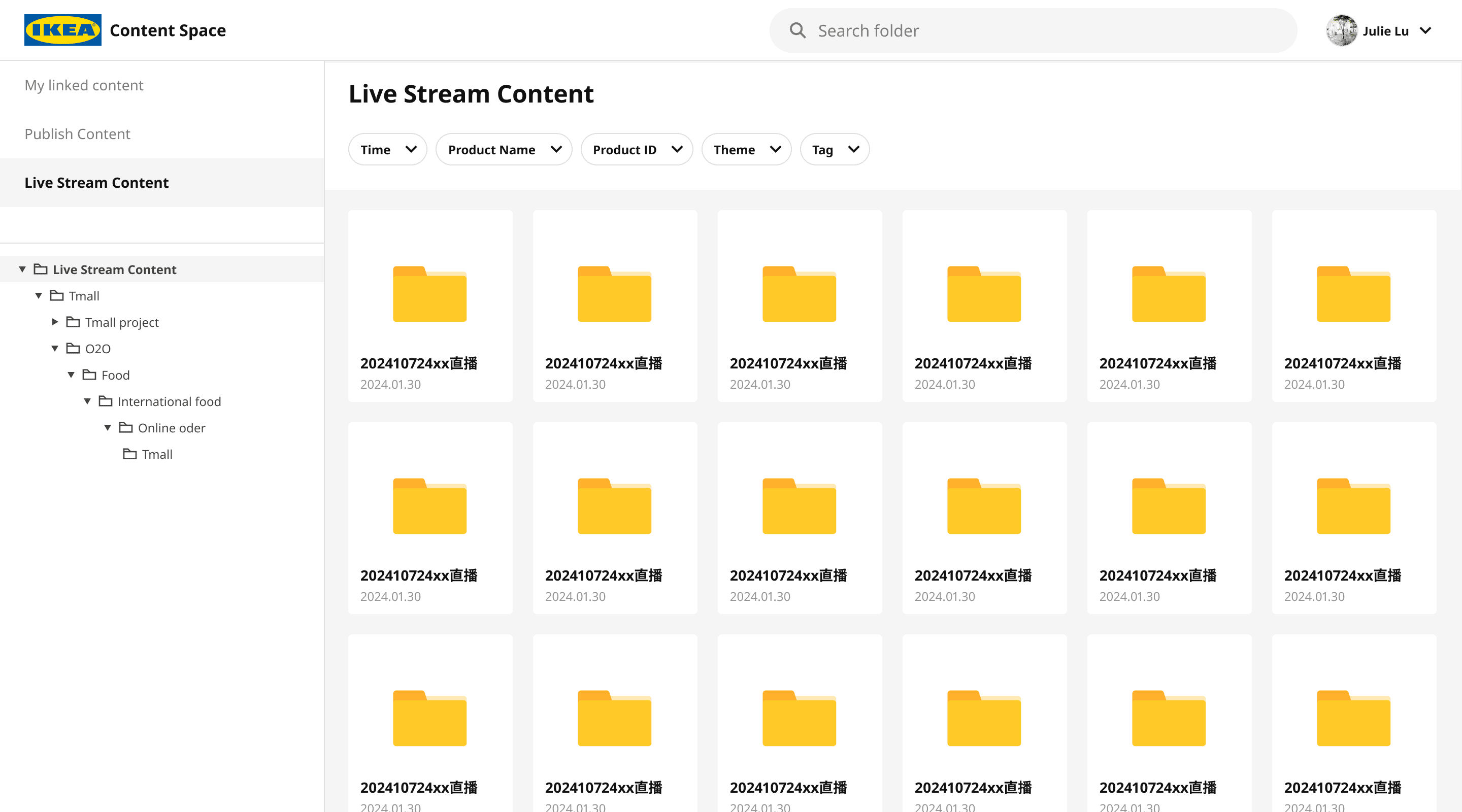
Content Management
File Management
Easily manage and tag files on this platform by using precise filters
Automatically map and sync local content from file folder path link to publish disk
Outcomes & Results
5000+
50+
5+
Local images and documents have been uploaded and synchronised on Asset Gallery
IKEA in-store employees from different cities have received the training of templates creation in Creator mode
New features design (e.g. co-creation) waiting for being iterated in next sprints
Moody
Content
Space
